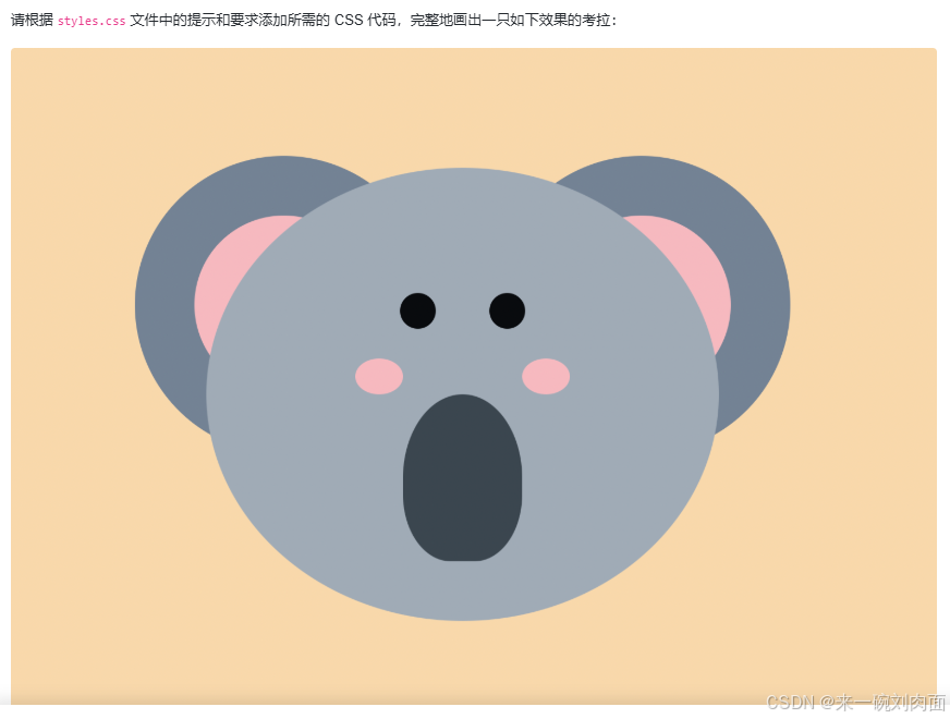
要求
CSS3 的 Flex 弹性布局和 Grid 网格布局已经成为前端页面排版的主流选择。
本次挑战将使用这两种布局方式来画一只考拉。
代码实现
html,
body {
background: #f8d8ab;
width: 100vw;
height: 100vh;
display: flex;
justify-content: center;
align-items: center;
}
.container {
display: flex;
flex-direction: column;
align-items: center;
}
.ears {
display: flex;
justify-content: space-between;
position: relative;
top: 240px;
width: 550px;
}
.ear {
width: 250px;
height: 250px;
border-radius: 50%;
background: #738394;
display: flex;
justify-content: center;
align-items: center;
}
.inner {
width: 150px;
height: 150px;
border-radius: 50%;
background: #f6b9bf;
}
.face {
z-index: 1;
width: 430px;
height: 380px;
background: #a0abb6;
border-radius: 50%;
align-items: center;
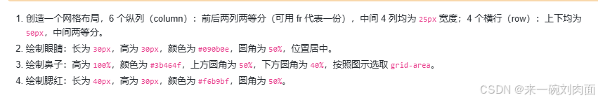
/* 创造一个网格布局
6 个纵列(column) --
前后两列两等分 (可用 fr 代表一份),
中间 4 列均为 25px 宽度
4 个横行(row) --
上下均为 50px,中间两等分
*/
display: grid;
grid-template-columns: 1fr 25px 25px 25px 25px 1fr;
grid-template-rows: 50px 1fr 1fr 50px;
}
.eye {
/*
长为 30px
高为 30px
颜色为 #090b0e
圆角为 50%
位置居中
*/
height: 30px;
height: 30px;
background-color: #090b0e;
border-radius: 50%;
justify-content: center;
align-items: center;
}
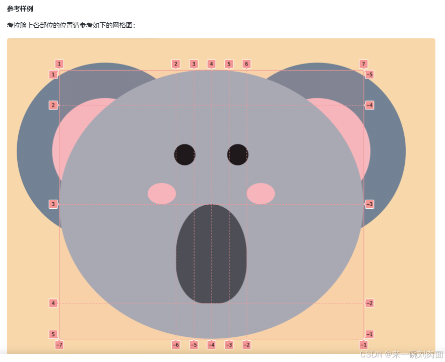
.eye.left {
/* 按照图示选取 grid-area */
grid-row: 2/3;
grid-column: 2/3;
}
.eye.right {
/* 按照图示选取 grid-area */
grid-column: 5/6;
grid-row: 2/3;
}
.nose {
/*
高为 100%
颜色为 #3b464f
上方圆角为 50%
下方圆角为 40%
按照图示选取 grid-area
*/
height: 100%;
background-color: #3b464f;
border-top-right-radius: 50%;
border-top-left-radius: 50%;
border-bottom-right-radius: 40%;
border-bottom-left-radius: 40%;
grid-row: 3/4;
grid-column: 2/6;
}
.blush {
/*
长为 40px
高为 30px
颜色为 #f6b9bf
圆角为 50%
*/
width: 40px;
height: 30px;
background-color: #f6b9bf;
border-radius: 50%;
}
.blush.left {
/* 按照图示选取 grid-area
并调整位置
*/
grid-area: 2/1/3/2;
align-self: end;
justify-self: end;
}
.blush.right {
/* 按照图示选取 grid-area
并调整位置
*/
grid-area: 2/6/3/7;
align-self: end;
justify-self: start;
}
// index.html
<!DOCTYPE html>
<html lang="en">
  <head>
    <meta charset="UTF-8" />
    <meta http-equiv="X-UA-Compatible" content="IE=edge" />
    <meta name="viewport" content="width=device-width, initial-scale=1.0" />
    <link rel="stylesheet" href="styles.css" />
    <title>CSS 考拉</title>
  </head>
  <body>
    <div class="container">
      <div class="ears">
        <div class="ear left">
          <div class="inner"></div>
        </div>
        <div class="ear right">
          <div class="inner"></div>
        </div>
      </div>

      <div class="face">
        <div class="eye left"></div>
        <div class="eye right"></div>
        <div class="blush left"></div>
        <div class="blush right"></div>
        <div class="nose"></div>
      </div>
    </div>
  </body>
</html>
// 注释代码
 <style>
    /* 对 html 和 body 元素进行样式设置
       设置背景颜色为 #f8d8ab
       设置宽度为视口宽度(100vw),高度为视口高度(100vh)
       使用 flex 布局,使内容在水平和垂直方向上都居中 */
    html,
    body {
      background: #f8d8ab;
      width: 100vw;
      height: 100vh;
      display: flex;
      justify-content: center;
      align-items: center;
    }

    /* 容器样式
       使用 flex 布局,设置主轴方向为列方向(flex-direction: column)
       使子元素在交叉轴上居中对齐(align-items: center) */
    .container {
      display: flex;
      flex-direction: column;
      align-items: center;
    }

    /* 耳朵容器样式
       使用 flex 布局,使子元素在主轴上两端对齐(justify-content: space-between)
       设置相对定位,向上偏移 240px(top: 240px)
       设置宽度为 550px */
    .ears {
      display: flex;
      justify-content: space-between;
      position: relative;
      top: 240px;
      width: 550px;
    }

    /* 单个耳朵样式
       设置宽度为 250px,高度为 250px,圆角为 50%(圆形)
       设置背景颜色为 #738394
       使用 flex 布局,使子元素在水平和垂直方向上都居中 */
    .ear {
      width: 250px;
      height: 250px;
      border-radius: 50%;
      background: #738394;
      display: flex;
      justify-content: center;
      align-items: center;
    }

    /* 耳朵内部样式
       设置宽度为 150px,高度为 150px,圆角为 50%(圆形)
       设置背景颜色为 #f6b9bf */
    .inner {
      width: 150px;
      height: 150px;
      border-radius: 50%;
      background: #f6b9bf;
    }

    /* 脸部样式
       设置 z 轴层级为 1,使其在其他元素之上显示
       设置宽度为 430px,高度为 380px,圆角为 50%(圆形)
       使用 grid 布局
       定义列布局:前后两列两等分 (用 fr 代表一份),中间 4 列均为 25px 宽度
       定义行布局:上下均为 50px,中间两等分 */
    .face {
      z-index: 1;
      width: 430px;
      height: 380px;
      background: #a0abb6;
      border-radius: 50%;
      align-items: center;
      display: grid;
      grid-template-columns: 1fr 25px 25px 25px 25px 1fr;
      grid-template-rows: 50px 1fr 1fr 50px;
    }

    /* 眼睛样式
       设置高度为 30px(这里 width 也写了 height,应该是 width 漏写了,假设是 width: 30px)
       设置背景颜色为 #090b0e
       设置圆角为 50%(圆形)
       使用 flex 布局,使子元素在水平和垂直方向上都居中(虽然这里没用到子元素) */
    .eye {
      width: 30px;
      height: 30px;
      background-color: #090b0e;
      border-radius: 50%;
      justify-content: center;
      align-items: center;
    }

    /* 左眼样式
       设置在网格中的区域:从第 2 行到第 3 行,从第 2 列到第 3 列 */
    .eye.left {
      grid-row: 2/3;
      grid-column: 2/3;
    }

    /* 右眼样式
       设置在网格中的区域:从第 5 列到第 6 列,从第 2 行到第 3 行 */
    .eye.right {
      grid-column: 5/6;
      grid-row: 2/3;
    }

    /* 鼻子样式
       设置高度为 100%
       设置背景颜色为 #3b464f
       设置上方圆角为 50%,下方圆角为 40%
       设置在网格中的区域:从第 3 行到第 4 行,从第 2 列到第 6 列 */
    .nose {
      height: 100%;
      background-color: #3b464f;
      border-top-right-radius: 50%;
      border-top-left-radius: 50%;
      border-bottom-right-radius: 40%;
      border-bottom-left-radius: 40%;
      grid-row: 3/4;
      grid-column: 2/6;
    }

    /* 腮红样式
       设置宽度为 40px,高度为 30px
       设置背景颜色为 #f6b9bf
       设置圆角为 50%(圆形) */
    .blush {
      width: 40px;
      height: 30px;
      background-color: #f6b9bf;
      border-radius: 50%;
    }

    /* 左腮红样式
       设置在网格中的区域:从第 2 行到第 3 行,从第 1 列到第 2 列
       在交叉轴上对齐到末端(底部)
       在主轴上对齐到末端(右侧) */
    .blush.left {
      grid-area: 2/1/3/2;
      align-self: end;
      justify-self: end;
    }

    /* 右腮红样式
       设置在网格中的区域:从第 2 行到第 3 行,从第 6 列到第 7 列
       在交叉轴上对齐到末端(底部)
       在主轴上对齐到起始端(左侧) */
    .blush.right {
      grid-area: 2/6/3/7;
      align-self: end;
      justify-self: start;
    }
  </style>
总结
- 熟悉 Grid 布局的相关属性:学习链接CSS Grid 网格布局教程 - 阮一峰的网络日志
- Flex 布局 : Flex 布局教程:语法篇 - 阮一峰的网络日志