1.小米模块练习
需求:
使用浮动,完成设计图中的布局效果
效果图如下:
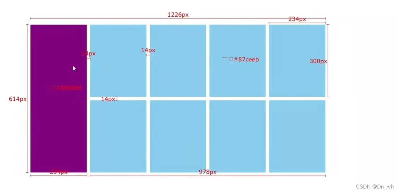
我写的,
和老师不一样的是我添加了蓝色的左边距,他添加的右边距。
添加左边距的话,八个方块的情况就都是一样的,就不需要添加伪类元素来清楚4、8的右边距了
<!DOCTYPE html>
<html lang="en">

<head>
    <meta charset="UTF-8">
    <meta http-equiv="X-UA-Compatible" content="IE=edge">
    <meta name="viewport" content="width=device-width, initial-scale=1.0">
    <title>Document</title>
    <style>
        /* 消除自带的边距 */
        * {
            margin: 0;
            padding: 0;
        }

        .one {
            /* 版心居中 */
            margin: 0 auto;
            width: 1226px;
            height: 614px;
            /* background-color: orange; */
        }

        .two {
            /* 浮动 */
            float: left;
            width: 234px;
            height: 614px;
            background-color: #800080;
        }

        li {
            /* 浮动:右 */
            float: right;
            width: 234px;
            height: 300px;
            background-color: #87ceeb;
            margin-left: 14px;
            margin-bottom: 14px;
        }

        /* 消除 li 自带的小圆点 */
        ul {
            list-style: none;
        }
    </style>
</head>

<body>
    <div class="one">
        <div class="two"></div>
        <ul>
            <li></li>
            <li></li>
            <li></li>
            <li></li>
            <li></li>
            <li></li>
            <li></li>
            <li></li>
        </ul>
    </div>
</body>

</html>
老师给的代码
<!DOCTYPE html>
<html lang="en">
<head>
    <meta charset="UTF-8">
    <meta http-equiv="X-UA-Compatible" content="IE=edge">
    <meta name="viewport" content="width=device-width, initial-scale=1.0">
    <title>Document</title>
    <style>
        * {
            margin: 0;
            padding: 0;
        }

        .box {
            margin: 0 auto;

            width: 1226px;
            height: 614px;
            /* background-color: pink; */
        }

        .left {
            float: left;

            width: 234px;
            height: 614px;
            background-color: #800080;
        }

        .right {
            float: right;

            width: 978px;
            height: 614px;
            /* background-color: green; */
        }

        ul {

            /* 去掉列表的符号 */
            list-style: none;
        }

        .right li {
            float: left;

            margin-right: 14px;
            margin-bottom: 14px;

            width: 234px;
            height: 300px;
            background-color: #87ceeb;
        }

        /* 如果父级的宽度不够, 子级会自动换行 */
        /* 第四个li和第八个li右侧间距清除 */
        .right li:nth-child(4n) {
            margin-right: 0;
        }
    </style>
</head>
<body>
    <div class="box">
        <div class="left"></div>
        <div class="right">
            <ul>
                <li></li>
                <li></li>
                <li></li>
                <li></li>
                <li></li>
                <li></li>
                <li></li>
                <li></li>
            </ul>
        </div>
    </div>
</body>
</html>
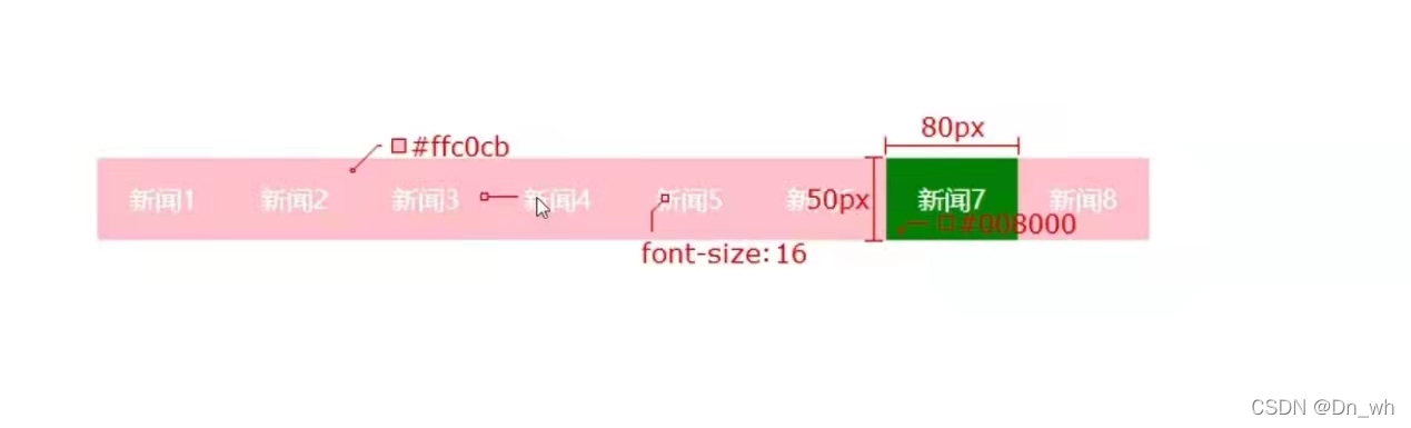
2.网页导航
效果图如下:
<!DOCTYPE html>
<html lang="en">

<head>
    <meta charset="UTF-8">
    <meta http-equiv="X-UA-Compatible" content="IE=edge">
    <meta name="viewport" content="width=device-width, initial-scale=1.0">
    <title>Document</title>
    <style>
        /* 顺序:浮动 盒子模型 文字样式 */

        * {
            margin: 0;
            padding: 0;
        }

        div {
            /* 居中 */
            margin: 0 auto;
            width: 640px;
            height: 50px;
            background-color: #ffc0cb;
        }

        li {

            float: left;
            width: 80px;
            height: 50px;

        }

        a {
            display: inline-block;
            color: #fff;
            text-decoration: none;
            /* 设置行高 */
            line-height: 50px;
        }

        /* 悬停效果 */
        a:hover {
            background-color: green;
        }
    </style>
</head>

<body>
    <div class="one">
        <ul>
            <li><a href="#">新闻</a></li>
            <li><a href="#">新闻</a></li>
            <li><a href="#">新闻</a></li>
            <li><a href="#">新闻</a></li>
            <li><a href="#">新闻</a></li>
            <li><a href="#">新闻</a></li>
            <li><a href="#">新闻</a></li>
            <li><a href="#">新闻</a></li>
        </ul>
    </div>
</body>

</html>