居中
一 居中布局:
水平居中:
1.inline-block + text-align
用法:对子框设置 display:inline-block,对父框设置text-align:center。
设置了inline-block属性的元素,既拥有了block元素可以设置width和height的特性,又保持了inline元素不换行的特性。
2.table+margin
用法:对子框设置块级表格(如table)display:table,再对子框设置水平居中 margin:0 auto
table:(块级表格)
border 规定表格边框的宽度
cellpadding 规定单元边沿与其内容之间的空白
cellspacing 规定单元格之间的空白
width 规定表格的宽度
border-collapse: collapse; 为表格设置合并边框模型 默认值为separate
rowspan跨行合并单元格
colspan跨列合并单元格
3. absolute + transform
用法:将子框设置为绝对定位,父框设置为相对定位,使父框成为子框的相对框,
(绝对定位、相对定位的关系:
1>在没有父级元素定位时,以浏览器的左上角为基准
2>有父级的情况下,父级设置相对定位,子级设置绝对定位 是以父盒子进行定位的
实际项目开发当中,这种“父相子绝”的样式手法经常用到。-----父相对,子绝对)
移动子框,先相对于父元素移动向右50%,再相对于自己移动向左50%。对父框:position:relative,对子框:position:absolute,left:50%,transform:translateX(-50%)
transform属性应用于元素的2D或3D转换。这个属性允许你将元素旋转,缩放,移动,倾斜等。
(1)translate(位移)
transform:translate(apx,bpx,cpx);
X,Y,Z表示x轴y轴和z轴;abc分别表示x轴,y轴和z轴偏移数值,可以为负数;
设置translate位移的元素是相对于自己原来的位置来改变位置,不脱离文档流,translate 位移时,默认原点是元素的中心位置。
(2)scale(缩放)
transform:scale(1.5);
表示元素放大1.5倍,如果要缩小0.5倍就将设为0.5即可,默认数值等于1。
也可以单独设置x轴的缩放和y轴的缩放,也可以将数值设置为负数
(3)rotate(旋转)
Transform:rotateX/rotateY/rotateZ;/*rotate(旋转)*/
rotateX(30deg)表示元素沿着x轴做旋转,30deg表示要沿着x轴方向的 顺时针旋转30度,将值设为负数则是逆时针旋转30度。
4. flex + margin
用法:利用flex将子框转换为flex item,再设置子框居中。将父框设置 display:flex,再设置子框margin:0 auto。设置了flex后不会被父框里的元素挤到下边,还保持水平排列。设为Flex布局后,子元素的float、clear和vertical-align属性将失效。
5. flex + justify-content(主轴上的对齐方式)
将父框设置为display:flex,再设置justify-content:center。
二. 垂直居中
1. table-cell + vertical-align
用法:将父框转化成一个表格单元格,( <td> 和 <th> ),再通过设置属性,使表格单元格内容垂直居中。父框:display:table-cell,vertical-align: middle。
2. absolute + transform
用法:父相子绝,父框:position: relative,子框:position: absolute,top:50%, transform: translateY(-50%)
3. flex + align-items(交叉轴上如何对齐)
用法:先将父框设置为display:flex,再设置align-items:center。
三. 水平垂直居中
1. absolute + transform
用法:absolute + transform的水平居中垂直居中结合
.parent {
position:relative;
}
.child {
position:absolute;
left:50%;
top:50%;
transform:tranplate(-50%,-50%);
}
2. inline-block + text-align(水平居中) + table-cell + vertical-align(垂直居中)
.parent {
text-align:center;
display:table-cell;
vertical-align:middle;
}
.child {
display:inline-block;
}
3. flex + justify-content + align-items
.parent {
 display:flex;
 justify-content:center;
 align-items:center;
 }
多列布局
一. 定宽 + 自适应
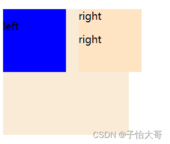
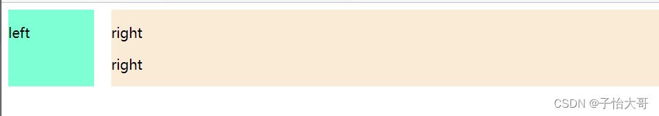
1. float + overflow
用法:将左边框脱离文本流,float: left 、width、margin-left,再设置实际的右框overflow: hidden.
规定当内容溢出元素框时,内容隐藏
<style>
        .box1{
            width: 100px;
            height: 100px;
            background-color:  antiquewhite;
            /**/

        }
        .box2{
            width: 50px;
            height: 50px;
            background-color:  blue;
            /**/
           float: left;
           margin-right:20px;
        }
        .box3{
            overflow: hidden ;
        }
</style>
<div class="box1">
        <div class="box2">
            <p>left</p>
        </div>
        <div class="box3">
            <p>right</p>
        </div>
</div>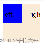
2. float + margin
用法:左框脱离文档流,float: left,,margin-left,右框向右一段距离,margin-left。
缺点:兼容性存在一定问题,ie6下有3px的bug。right下的p清除浮动将产生bug。
.box1{
            width: 200px;
            height: 200px;
            background-color:  antiquewhite;
            /**/

        }
        .box2{
            width: 100px;
            height: 100px;
            background-color:  blue;
            /**/
           float: left;
        }
        .box3{
            width: 100px;
            height: 100px;
            background-color: bisque;
            margin-left: 120px;
        }
3. float + margin(改良版)
在上一个基础上,向右框添加一个父框,加上设置左右父框属性,产生BFC去除bug
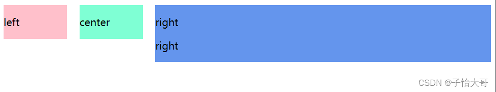
用法:先将左框设置为float: left, margin: left, position: relative, 再设置右父框float: right, width: 100%, margin - left, 最后设置实际的右框 margin - left。
.left{
            width: 100px;
            background-color:  blue;
            /**/
            float: left;
            position: relative;
        }
        .right-fix{
            background-color: bisque;
            float: right;
            margin-left: -120px;
            width: 100%;
        }
        .right{
            margin-left: 120px;
        }
<div class="parent">
        <div class="left">
            <p>left</p>
        </div>
        <div class="right-fix">
            <div class="right">
                <p>right</p>
                <p>right</p>
            </div>
        </div>
    </div>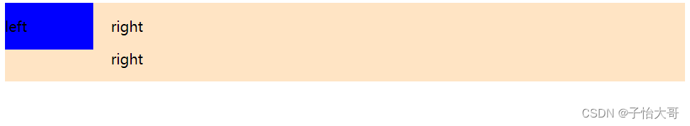
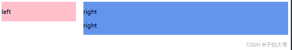
4. table
用法:通过将父框设置为表格,display: table, width: 100%,table-layout: fixed, 将左右框转化为同一行的 td ,达到多列布局, 左右框:display: table-cell, 设置左框,width, padding-right。
(display:table-cell
指让标签元素以表格单元格的形式呈现,使元素类似于td标签。
属性:
1.对宽度高度敏感
2.对margin值无反应
3.响应padding属性
4.内容溢出时会自动撑开父元素
table-layout:fixed
属性的用法:
如果想要一个table固定大小,里面的文字强制换行(尤其是在一长串英文文本,并且中间无空格分隔的情况下),以达到使过长的文字,不撑破表格的目的。)
.parent{
          display: table;
          width: 100%;
          table-layout: fixed;
      }
        .left{
            width: 100px;
            background-color:  blue;
            padding-right: 20px;
        }

        .right, .left{
            display: table-cell;
        }
<div class="parent">
        <div class="left">
            <p>left</p>
        </div>
        <div class="right">
            <p>right</p>
            <p>right</p>
        </div>
    </div>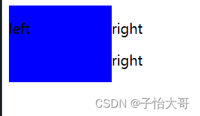
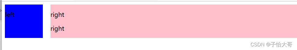
5. flex
用法:将父框设置为 display:flex,再设置左框 flex: 1, width,margin-right。
.parent{
          display: flex;
      }
        .left{
            width: 100px;
            background-color:  blue;
            margin-right: 20px;
        }

        .right{
            width: 100px;
            background-color:  pink;
            flex:1;
        }
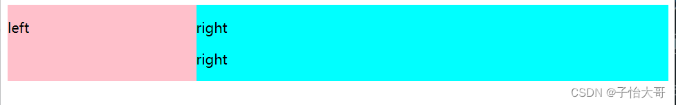
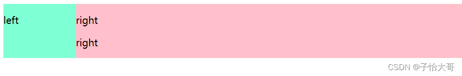
两列定宽 + 一列自适应
用法:先将左、中框设置为 float:left,width,margin-right,再设置右框 overflow:widden。
.left{
            background-color: pink;
        }
        .center{
            background-color: aquamarine;
        }

      .left, .center{
          float: left;
          width: 100px;
          margin-right: 20px;
      }
      .right{
         overflow: hidden;
          background-color: cornflowerblue;
      }
不定宽 + 自适应
1. float + overflow
用法:将左框设置为float: left, margin-right, 再设置右框 overflow:hidden,最后再设置左框中的内容width。
.left{
            background-color: pink;
            margin-right: 20px;
            float: left;

        }

      .right{
         overflow: hidden;
          background-color: cornflowerblue;
      }
      .left p{
          width: 200px;
      }
2. table
用法:将父框改变为表格,display:table、width:100%,将左右框转换为类似于同一行的 td 达到多列布局,display:table-cell,最后设置左框width:0.1%(当左框没有设置宽度且没有元素时,显示出有左框的存在),padding-right,以及左框内容的width。
.parent{
            display: table;
            width: 100%;
        }
        .left, .right{
            display: table-cell;
        }
        .right{
            background-color: cyan;
        }
        .left{
            width: 0.1%;
            background-color: pink;
            padding-right: 20px;
        }
      .left p{
          width: 200px;
      }
3. flex
原理:先将父框设置为 display:flex,再给左框中的内容定宽,设置左框margin-right:20px,左框内容:width,给右框设置flex达到不定宽 + 自适应。
.parent{
            display: flex;
        }
        .right{
            background-color: cyan;
            flex: 1;
        }
        .left{
            margin-right: 20px;
            background-color: pink;
        }
      .left p{
          width: 200px;
      }
两列不定宽 + 一列自适应
用法:先将左、中框设置为 float:left,margin-right,再设置右框 overflow:hidden,最后给左中框内容设置width。
overflow:hidden 解决高度塌陷
.right{
            background-color: cyan;
            overflow: hidden;
        }
        .left{
            margin-right: 20px;
            background-color: pink;
        }
        .center{
            margin-right: 20px;
            background-color: bisque;
        }
      .left p, .center p{
        width: 200px;
      }
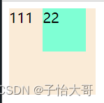
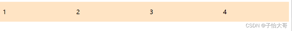
等分布局
要解决问题的两个方法:
(1) 如何让总宽度增加g (L+g)
(2) 如何让每个宽包含g(w+g)
1. float
原理:增大父框的实际宽度后,用box-sizing。
用法:先将父框设置为 margin-left:-*px,再设置子框float:left,width:25%, padding-left, box-sizing: border-box.
(box-sizing 属性可以被用来调整这些表现:
content-box 是默认值。如果你设置一个元素的宽为100px,那么这个元素的内容区会有100px宽,并且任何边框和内边距的宽度都会被增加到最后绘制出来的元素宽度中。
border-box 设置的边框和内边距的值是包含在width内的。也就是说,如果你将一个元素的width设为100px,那么这100px会包含其它的border和padding,内容区的实际宽度会是width-(border + padding)
。大多数情况下这使得我们更容易的去设定一个元素的宽高。
border-box width 和 height 属性包括内容,内边距和边框,但不包括外边距。这是当文档处于 Quirks模式 时Internet Explorer使用的 盒模型。注意,填充和边框将在盒子内 , 例如, .box {width: 350px; border: 10px solid black;} 导致在浏览器中呈现的宽度为350px的盒子。内容框不能为负,并且被分配到0,使得不可能使用border-box使元素消失。
这里的维度计算为:
width = border + padding + 内容的 width,
height = border + padding + 内容的 height。)
.parent{
            margin-left: -20px;
        }
        .column{
            float: left;
            width: 25%;
            background-color: bisque;
            padding-left: 20px;
            box-sizing: border-box;
        }
<div class="parent">
        <div class="column">
            <p>1</p>
        </div>
        <div class="column">
            <p>2</p>
        </div>
        <div class="column">
            <p>3</p>
        </div>
        <div class="column">
            <p>4</p>
        </div>
    </div>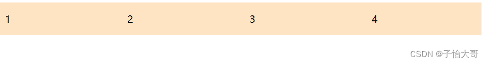
2. table
原理:增加一个父框的修正框,增大宽度,将父框转化为table,将子框转化为table-cell。
用法:先将父框的修正框设置为 margin-left:-*px,再设置display: table, width:100%, table-layout: fixed, 设置子框display: table-cell, padding-left。
(给table元素添加 table-layout: fixed; 或者给td添加 word-break: break-all ,都可以达到表格按照我们设置的宽度显示)
.parent-fix{
            margin-left: -20px;
        }
        .parent{
            display: table;
            width: 100%;
            table-layout: fixed;
        }
        .column{
            background-color: bisque;
            padding-left: 20px;
            display: table-cell;
        }
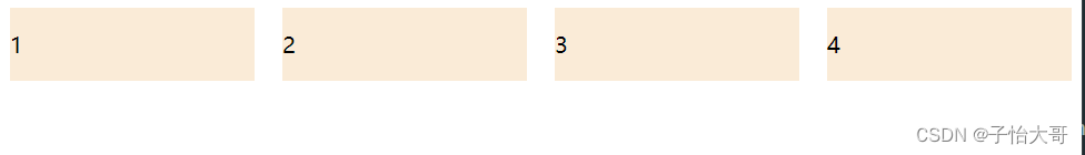
3. flex
用法:将父框设置为 display:flex,再设置子框flex:1,最后设置子框与子框的间距margin-left。
(.item { flex: none } 等同于 .item { flex-grow: 0; flex-shrink: 0; flex-basis: auto }
.item { flex: 1 } 等同于 .item { flex-grow: 1; flex-shrink: 1; flex-basis: 0% }
flex-grow: 1表示撑满
flex-shrink的用法同flex-grow相同,只是前者是当空间不足的时候都等比缩小,如果设置其中一个元素值为非1的话则不会同比缩小,其它同级的缩小)
.parent{
            display: flex;
        }
        .column{
            flex: 1;
            background-color: antiquewhite;
        }
        .column+.column{
            margin-left: 20px;
        }
定宽 + 自适应 + 两块高度一样高
1.float
原理:过分加大左右子框的高度,辅助超出隐藏,达到视觉上的等高。
用法:将父框设置为overflow:hidden,再设置左右子框 padding-bottom:9999px,margin-bottom:-9999px,最后设置左框float: left, width, margin-right, 右框 overflow:hidden。
p{
            background: none !important;
        }
        .left, .right{
            background: pink;
            padding-bottom: 9999px;
            margin-bottom: -9999px;
        }
        .parent{
            overflow: hidden;
        }
        .left{
            float: left;
            width: 100px;
            margin-right: 20px;
        }
        .right{
            overflow: hidden;
        }
<div class="parent">
        <div class="left">
            <p>left</p>
        </div>
        <div class="right">
            <p>right</p>
            <p>right</p>
        </div>
    </div>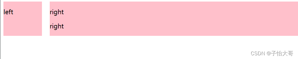
2. table
原理:将父框设置为 display:table,width: 100%, table-layout: fixed, 再设置左右框为display: table-cell, 最后设置左框width, padding-right.
.parent{
           display: table;
           width: 100%;
           table-layout: fixed;
       }
        .left, .right{
            background: pink;
            display: table-cell;
        }
        .left{
            background-color: aquamarine;
            width: 100px;
            padding-right: 20px;
        }
3. flex
用法:将父框设置为display: flex, 再设置左框 width,margin-right,最后设置右框flex:1。
.parent{
           display: flex;
       }
        .left{
            width: 100px;
            margin-right: 20px;
            background-color: aquamarine;
        }
        .right{
            flex: 1;
            background-color: antiquewhite;
        }
4. display
用法:将父框设置为 display:-webkit-box, width: 100%, 再设置左框 width, margin-right, 最后再设置右框-webkit-box-flex:1; /* 一比一*/
(-webkit-box的用法
1.之前要实现横列的web布局,通常就是float或者display:inline-block;但是都不能做到真正的流体布局。至少width要自己去算百分比。
2.flexiblebox就可以实现真正意义上的流体布局。只要给出相应属性,浏览器会帮我们做额外的计算。
3.box-flex是css3新添加的盒子模型属性,它的出现可以解决我们通过N多结构、css实现的布局方式。经典的一个布局应用就是布局的垂直等高、水平均分、按比例划分。
目前box-flex属性还没有得到firefox、Opera、chrome浏览器的完全支持,但可以使用它们的私有属性定义firefox(-moz)、opera(-0)、chrome/safari(-webkit)。
)
.parent{
           width: 100%;
           display: -webkit-box;
       }
        .left{
            width: 100px;
            margin-right: 20px;
            background-color: aquamarine;
        }
        .right{
            -webkit-box-flex: 1;
            background-color: antiquewhite;
        }
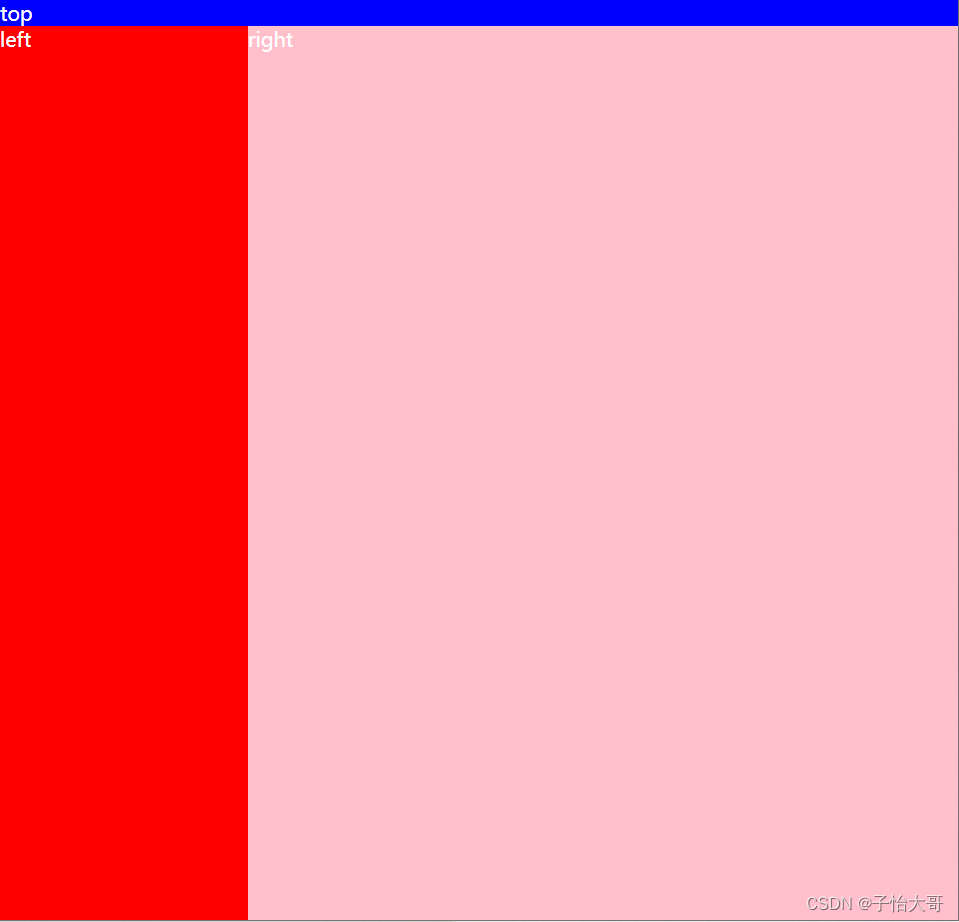
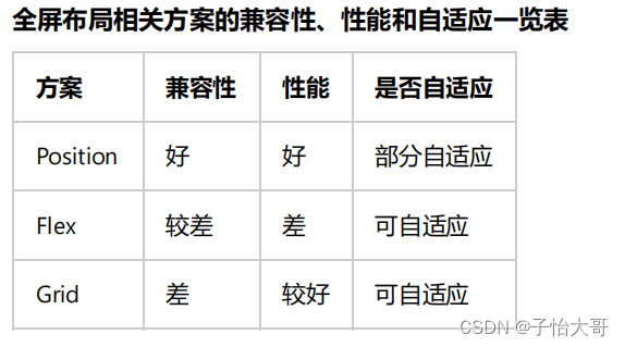
全屏布局
特点:1. 滚动条不是全局滚动条,而是出现在内容区域内里,往往是主内容区域。2. 浏览器变大时,撑满窗口。
1. position
<div class="parent">
 <div class="top">top</div>
 <div class="left">left</div>
 <div class="right">
 <div class="inner">right</div>
 </div>
 <div class="bottom">bottom</div>
</div>

html,body,.parent{
 margin:0;
 height:100%;
 overflow:hidden; }
body{
 color:white; }.top{
 position:absolute;
 top:0;
 left:0;
 right:0;
 height:100px;
 background:blue; }.left{
 position:absolute;
 left:0;
 top:100px;
 bottom:50px;
 width:200px;
 background:red; }.right{
 position:absolute;
 left:200px;
 top:100px;
 bottom:50px;
 right:0;
 background:pink;
 overflow: auto; }.right .inner{
 min-height: 1000px; }.bottom{
 position:absolute;
 left:0;
 right:0;
 bottom:0;
 height:50px;
 background: black; }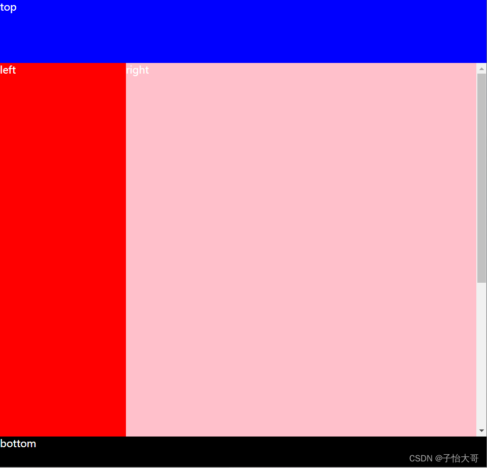
2. flex