目录
1.线性渐变
1.从上到下的渐变
<!DOCTYPE html>
<html lang="en">
<head>
<meta charset="UTF-8">
<title>线性渐变</title>
<style type="text/css">
.box{
		height: 200px;
		background-color: red;
		background-image:linear-gradient(red,yellow,blue);}
</style>
</head>
<body>
	<div class="box"></div>
</body>
</html>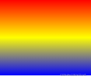
2. 从左到右的渐变
<style type="text/css">
#box {
  height: 200px;
  background-color: red; /* 针对不支持渐变的浏览器 */
  background-image: linear-gradient(to right, red , blue);
}
</style>
3.对角线渐变
<style type="text/css">
#box {
  height: 200px;
  background-color: red;
  background-image: linear-gradient(to bottom right, red, blue);
}
</style>
4.使用角度的渐变
取代预定义的方向(向下、向上、向右、向左、向右下等等)。值 0deg 等于向上(to top)。值 90deg 等于向右(to right)。值 180deg 等于向下(to bottom)。
<style type="text/css">
#box {
height: 100px;
background-color: red;
background-image: linear-gradient(90deg, red, yellow);
}
</style>
5.使用多个色标
<style type="text/css">
#box {
  height: 200px;
  background-color: red; /* 针对不支持渐变的浏览器 */
  background-image: linear-gradient(red, orange, yellow, green, blue, indigo, violet);
}
</style>
6.使用透明度
如需添加透明度,我们使用 rgba() 函数来定义色标。 rgba() 函数中的最后一个参数可以是 0 到 1 的值,它定义颜色的透明度:0 表示全透明,1 表示全彩色(无透明)。
<style type="text/css">
.box {
  height: 200px;
  background-image: linear-gradient(to right, rgba(255,0,0,0), rgba(255,0,0,1));
}
</style>
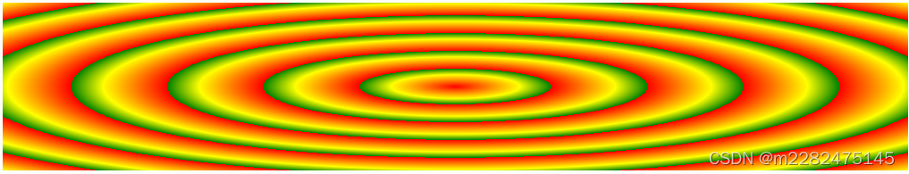
7.重复线性渐变
用repeating-linear-gradient()属性
<style type="text/css">
box {
  height: 200px;
  background-color: red;
  background-image: repeating-linear-gradient(red, yellow 10%, green 20%);
}
</style>
2.径向渐变
语法格式:
background-image: radial-gradient(shape size at position, start-color, ..., last-color);
默认地,shape 为椭圆形,size 为最远角,position 为中心。
1.均匀间隔的色标(默认)
<!DOCTYPE html>
<html lang="en">
<head>
	<meta charset="UTF-8">
	<title>径向渐变</title>
	<style type="text/css">
	.box{
		height: 300px;
		background-image: radial-gradient(red,yellow,blue)
	}
	</style>
</head>
<body>
	<div class="box"></div>
</body>
</html>
2.不同间距的色标
<style type="text/css">
.box {
  height: 150px;
  width: 200px;
  background-color: red;
  background-image: radial-gradient(red 5%, yellow 15%, green 60%);
}
</style>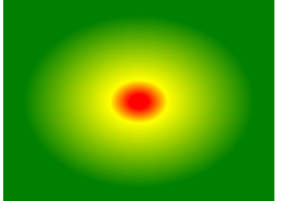
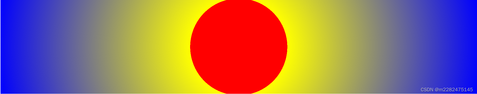
3.设置形状
用shape 定义形状。
circle 或 ellipse 值。默认值为 ellipse(椭圆)。
<style type="text/css">
.box{
		height: 300px;
		background-image: radial-gradient(circle,red 20%,yellow 20%,blue)
	}
</style>
4.使用大小不同的关键字
用size属性
- closest-side
- farthest-side
- closest-corner
- farthest-corner(默认)
<style type="text/css">
#box {
  height: 150px;
  width: 150px;
  background-color: red; /* 针对不支持渐变的浏览器 */
  background-image: radial-gradient(farthest-side at 60% 55%, red, yellow, black);
}
</style>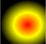
5.重复径向渐变
用repeating-radial-gradient() 属性
<style type="text/css">
#box{
  height: 150px;
  width: 200px;
  background-color: red; /* 针对不支持渐变的浏览器 */
  background-image: repeating-radial-gradient(red, yellow 10%, green 15%);
}
</style>