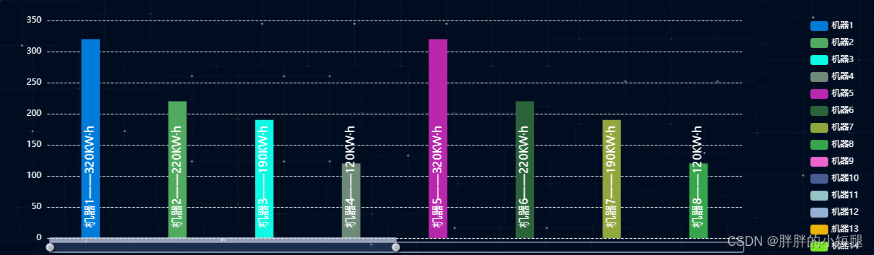
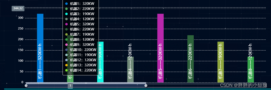
实现效果:
代码:
initEcharts2Inner(val) {
var self = this
// console.log(val.yData)
// console.log(val.xData)
const chart = echarts.getInstanceByDom(document.getElementById('eChart9'))
if (chart == undefined) {
} else {
echarts.dispose(chart)
}
this.chart = echarts.init(document.getElementById('eChart9'))
const posList = [
'left',
'right',
'top',
'bottom',
'inside',
'insideTop',
'insideLeft',
'insideRight',
'insideBottom',
'insideTopLeft',
'insideTopRight',
'insideBottomLeft',
'insideBottomRight'
];//文字位置配置
app.config = {
rotate: 90,
align: 'left',
verticalAlign: 'middle',
position: 'insideBottom',
distance: 15,
onChange: function () {
const labelOption = {
rotate: app.config.rotate,
align: app.config.align,
verticalAlign: app.config.verticalAlign,
position: app.config.position,
distance: app.config.distance
};
// myChart.setOption({
// series: [
// {
// label: labelOption
// },
// {
// label: labelOption
// },
// {
// label: labelOption
// },
// {
// label: labelOption
// }
// ]
// });
}
};
const labelOption = {
show: true,
position: app.config.position,
distance: app.config.distance,
align: app.config.align,
verticalAlign: app.config.verticalAlign,
rotate: app.config.rotate,
formatter: '{a}——{c}KW·h',
fontSize: 16,
rich: {
name: {}
},
textStyle:{
color:'#FFFFFF'
}
};
const option = {
// title: {
// show: true,
// text: "能耗汇总",
// x:'center',
// textStyle:{
// color:"#FFFFFF"
// }
// },
tooltip: {
trigger: 'axis',
position: val.legend.length < 10 ? 'bottom': function (point, params, dom, rect, size) {
return [point[0]+10, -10] //返回x、y(横向、纵向)两个点的位置
},
formatter: function(params){
var count = 0;
var str = "";
val.yData1.forEach(function(item,index) {
if(count == 0){
str += `能耗对比</br><div style="width: 10px;height: 10px;margin-right:10px;display: inline-block;border-radius: 5px;background-color: ${self.colorList[index]}"></div>${val.legend[index]}:${item}KW`;
}else{
str += `<br/><div style="width: 10px;height: 10px;margin-right:10px;display: inline-block;border-radius: 5px;background-color: ${self.colorList[index]}"></div>${val.legend[index]}:${(+(item) + 'KW')}`;
}
count ++;
})
return str;
},
backgroundColor: "rgba(0,0,0,0.6)",
textStyle: {
color: "#fff",
},
axisPointer: {
type: 'cross',
label: {
backgroundColor: '#6a7985'
}
}
},
axisPointer: {
show:true,
type:'none',
triggerTooltip:false,
triggerEmphasis:false,
},
emphasis:{
disabled:true
},
dataZoom: [{
type: 'inside',
start: 0,
end: 50,
},
{
show:true,
start: 0,
end: 50,
handleIcon: 'M10.7,11.9v-1.3H9.3v1.3c-4.9,0.3-8.8,4.4-8.8,9.4c0,5,3.9,9.1,8.8,9.4v1.3h1.3v-1.3c4.9-0.3,8.8-4.4,8.8-9.4C19.5,16.3,15.6,12.2,10.7,11.9z M13.3,24.4H6.7V23h6.6V24.4z M13.3,19.6H6.7v-1.4h6.6V19.6z',
handleSize: '80%',
handleStyle: {
color: '#fff',
shadowBlur: 3,
shadowColor: 'rgba(0, 0, 0, 0.6)',
shadowOffsetX: 2,
shadowOffsetY: 2
},
xAxisIndex: [0],
filterMode: 'empty',
bottom: 30,
height: 15,//这里可以设置dataZoom的尺寸
}],
legend: {
type: 'scroll',
orient:'vertical',
right:'0%',
bottom:'5%',
pageIconColor: '#aaa',
pageIconInactiveColor: '#2f4554',
pageTextStyle: { // 图例页信息的文字样式
color: '#fff'
},
textStyle:{
color:'#FFFFFF'
},
data: val.legend
},
// toolbox: {
// show: true,
// orient: 'vertical',
// left: 'right',
// top: 'center',
// feature: {
// mark: { show: true },
// dataView: { show: true, readOnly: false },
// magicType: { show: true, type: ['line', 'bar', 'stack'] },
// restore: { show: true },
// saveAsImage: { show: true }
// }
// },
grid: {
left: '3%',
right: '14%',
bottom: '6%',
top:'12%',
containLabel: true
},
xAxis: [
{
type: 'category',
show:false,
axisTick: { show: false },
axisLabel:{
textStyle:{
color:'#FFFFFF'
}
},
axisLine:{
lineStyle:{
color:'#FFFFFF'
}
},
}
],
yAxis: [
{
type: 'value',
axisLabel:{
textStyle:{
color:'#FFFFFF'
}
},
axisLine:{
lineStyle:{
color:'#FFFFFF'
}
},
splitLine: {
lineStyle: {
color: '#fff',
type:'dashed'
}
}
}
],
series:[]
};
val.yData.forEach((item, index) =>{
option.series.push({
name: val.legend[index],
type: 'bar',
label: labelOption,
emphasis: {
focus: 'series'
},
itemStyle:{
normal:{
color:self.colorList[index]
},
// opacity: item[0]==0 ? 0.05 : 1 ,
// borderColor:item[0]==0 ? 'red' : 'transparent'
},
// barMinHeight: 1,
barWidth:26,
barGap:'-100%',
data: item
})
})
self.chart.setOption(option,true)
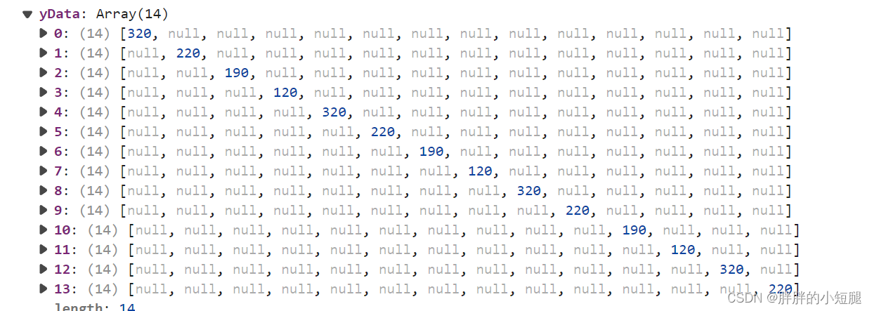
},如果数据返回的是一维数组,那么legend的配置就不生效,并且echarts自带的tooltip是单个对比,不能实现所需要求.所以这边只能将每个数据装进一个数组中
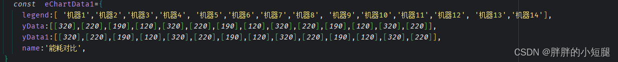
但是这时候将其循环放入series中发现,数据会显示不全,并且加入dataZoom的时候,图中的柱子会整体向左偏移(目前还没找到原因),后来发现一种方法,将数据格式变为
这种格式时,并且在series中加入'barGap:'-100%'',这样可以完全显示,但是此时会发现tooltip如果使用echarts自带的配置会出现问题(当鼠标移入到某一个柱子上时,只出现当前柱子的数据,其他柱子的数据全是null),这是就需要自己配置tooltip.这里我使用了两种数据,主要为了方便配置tooltip
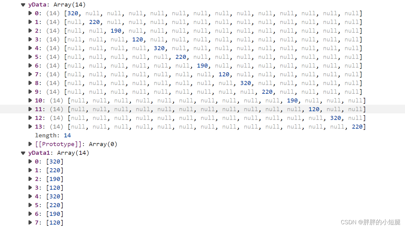
这里的yData用在series中的数据,yData1用在tooltip的显示.
 tooltip: {
          trigger: 'axis',
          position: val.legend.length < 10 ? 'bottom': function (point, params, dom, rect, size) {
            return [point[0]+10, -10]  //返回x、y(横向、纵向)两个点的位置
          },
          formatter: function(params){
            var count = 0;
            var str = "";
            val.yData1.forEach(function(item,index) {
              if(count == 0){
                str += `能耗对比</br><div style="width: 10px;height: 10px;margin-right:10px;display: inline-block;border-radius: 5px;background-color: ${self.colorList[index]}"></div>${val.legend[index]}:${item}KW`;
              }else{
                str += `<br/><div style="width: 10px;height: 10px;margin-right:10px;display: inline-block;border-radius: 5px;background-color: ${self.colorList[index]}"></div>${val.legend[index]}:${(+(item) + 'KW')}`;
              }
              count ++;
            })
            return str;
          },
          backgroundColor: "rgba(0,0,0,0.6)",
          textStyle: {
            color: "#fff",
          },

          axisPointer: {
            type: 'cross',
            label: {
              backgroundColor: '#6a7985'
            }
          }
        },
tooltip的数据自定义显示:通过返回的数据进行循环,并且自定义tooltip样式,将数据全部插入.colorList是我自定义的全局颜色数组.最终实现的效果如最上面所示.