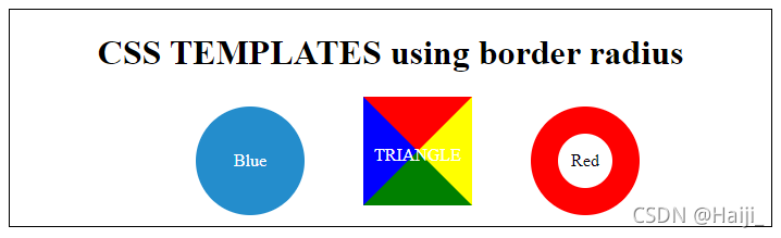
【css】border制作各种样式:圆形、三角形、同心圆
<!DOCTYPE html>
<html lang="en">
<head>
<meta charset="UTF-8">
<title>Title</title>
<style>
#content {
border: 1px solid #000000;
width: 700px;
margin: 0 auto;
text-align: center;
}
#content div:first-of-type {
width: 100px;
height: 100px;
color: white;
border-radius: 50%;
line-height: 100px;
background-color: #248dcc;
}
#content div:nth-of-type(2) {
width: 0;
height: 0;
border-top: 50px solid red;
border-left: 50px solid blue;
border-right: 50px solid yellow;
border-bottom: 50px solid green;
}
#content div:last-of-type {
width: 50px;
height: 50px;
border: 25px solid red;
border-radius: 50px;
line-height: 50px;
}
.text {
color: white;
position: relative;
top: -5px;
left: -40px;
}
#content div{
display:inline-block;
margin-left: 50px;
margin-bottom: 10px;
}
</style>
</head>
<body>
<div id="content">
<h1>CSS TEMPLATES using border radius</h1>
<div>Blue</div>
<div><span class="text">TRIANGLE</span></div>
<div>Red</div>
</div>
</body>
</html>