文章目录
一、申明规则
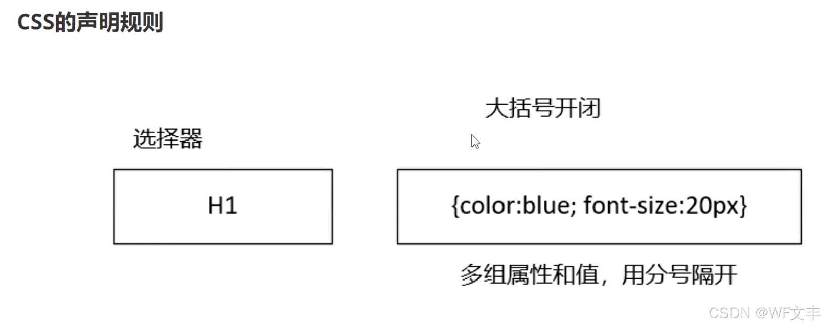
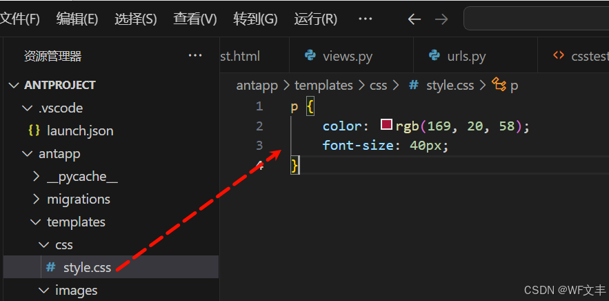
CSS的导入方式
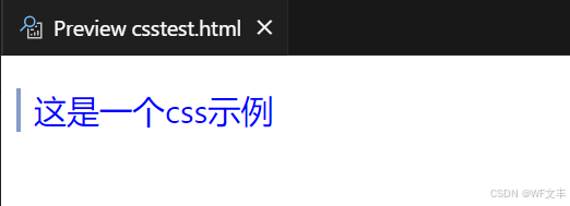
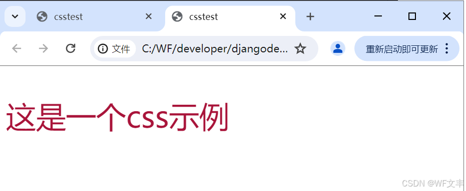
<p style="color: blue; font-size: 20px;">这是一个css示例</p>
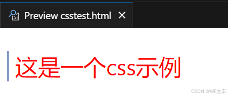
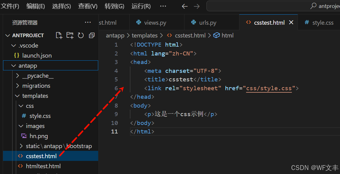
<!DOCTYPE html>
<html lang="zh-CN">
<head>
    <meta charset="UTF-8">
    <title>csstest</title>
    <style>
        p {
            color: red;
            font-size: 30px;
        }
    </style>
</head>
<body>
    <p>这是一个css示例</p>
</body>
</html>
二、CSS的选择器
1. 基本选择器
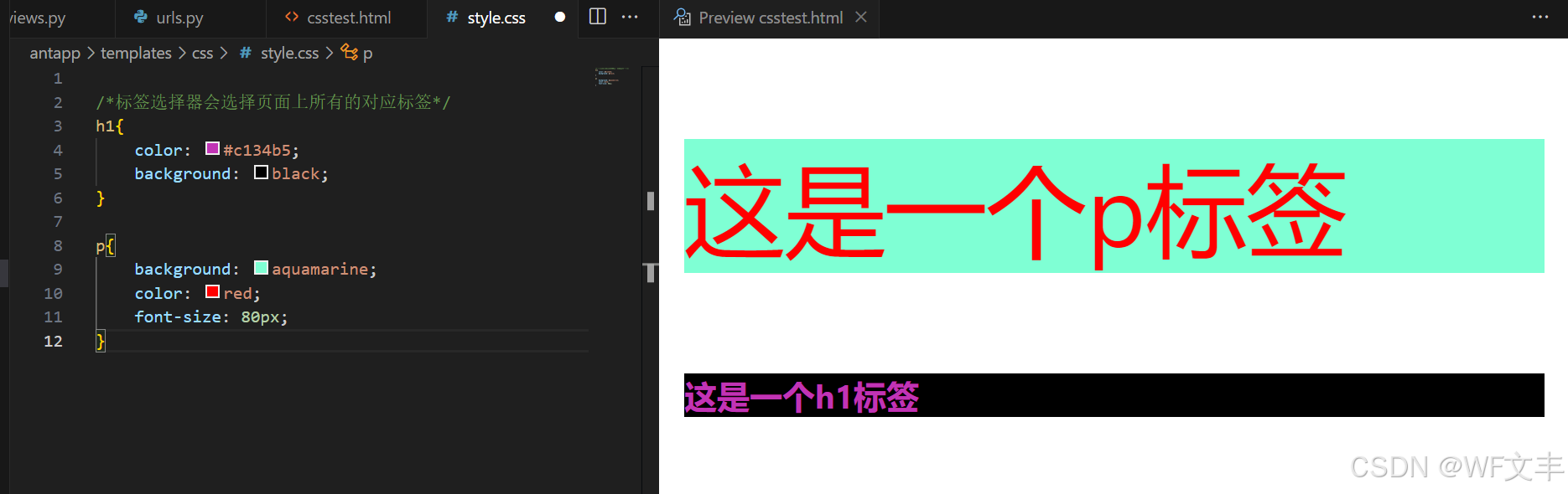
/*标签选择器会选择页面上所有的对应标签*/
h1{
    color: #c134b5;
    background: black;
}

p{
    background: aquamarine;
    color: red;
    font-size: 80px;
}
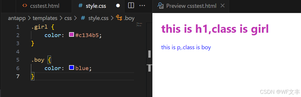
.girl{
    color: #c134b5;
	}
.boy{
    color: blue;
	}
<h1 class="girl">this is h1,class is girl</h1>
<p class="boyl">this is p,.class is boy</p>
    <body>
        <!--id选择器 : id必须保证全局唯一
    #id 名称{}
    不遵循就近 原则,固定的
    优先级: id选择器 > class选择器 > 标签选择器
    -->
        <style>
        #girl{
            color: #c134b5;
        }
        #boy{
            color: blue;
        }
    </style>
        <h1 id="girl">this id is girl</h1>
        <p id="boy">this id is boy</p>
    </body>
2.层次选择器
body p{
    background: #c134b5;
}
body>p{
    backgroulnd: #c134b5;
}
/兄弟选择器: 只有一个,向下/
/兄弟选择器: 只有一个,向下/
.active +p{
    background: #c134b5;
}
/通用兄弟选择器, 当前选中元素的向下所有的兄弟元素/
/*通用兄弟选择器, 当前选中元素的向下所有的兄弟元素*/
.active~p{
    background: #c134b5;
}
3.结构伪类选择器
伪类: 条件
/*ul的第一个子元素*/
ul li:first-child{
    background: #24ff33;
}
/*ul的最后一个子元素*/
ul li:last-child{
    background: red;
}
/*选中p1: 定位到父元素,选择当前的第一个元素
  选择当前p元素的父级元素,选中父级元素的第一个
  并且是当前元素才生效!
  */
p:nth-child(2){
    background: #67e4ff;
}
/*选中父元素下的p元素的第二个,类型 */
p:nth-of-type(2){
    background: yellow;
}
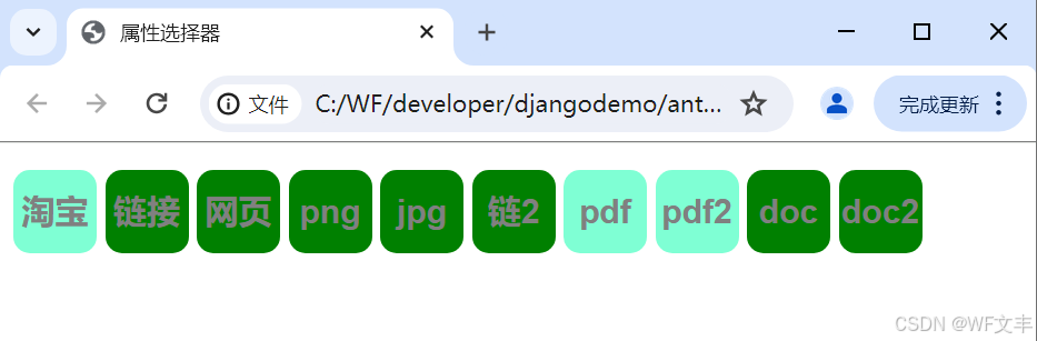
4.属性选择器
id + class 结合
<!DOCTYPE html>
<html lang="zh-CN">
<head>
    <meta charset="UTF-8">
    <title>属性选择器</title>
    <style>
        .demo a{
            float: left;
            display: block;
            height: 50px;
            width: 50px;
            border-radius: 10px;
            background: aquamarine;
            text-align: center;
            color: gray;
            text-decoration: none;
            margin-right: 5px;
            line-height:50px;
            font: bold 20px/50px Arial;
        }
        /*
        属性名,属性名 = 属性值(正则)
              = 表示绝对等于
             *= 表示包含
             ^= 表示以...开头
             $= 表示以...结尾
             存在id属性的元素
                a[]{}
         */
        a[id]{
            background: deeppink;
        }
        a[id=first]{
            /*
            id=first的元素
            */
            background: greenyellow;
        }
        a[class*="links"]{
            /*
            class 中有links的元素
            */
            background: green;
        }
        a[href^=http]{
            /*
            选中href中以http开头的元素
            */
            background: aquamarine;
        }
        a[href$=pdf]{
            /*
            选中href中以http开头的元素
            */
            background: aquamarine;
        }
    </style>
</head>
<body>
<p class="demo">
    <a href="https://www.taobao.com/" class="links item first" id="first">淘宝</a>
    <a href="" class="links item active" target="_blank " title="test">链接</a>
    <a href="img/hello.html" class="links item">网页</a>
    <a href="img/str1.png" class="links item">png</a>
    <a href="img/str2.jpg" class="links item">jpg</a>
    <a href="abc" class="links item">链2</a>
    <a href="/fy.pdf" class="links item">pdf</a>
    <a href="/quit.pdf" class="links item">pdf2</a>
    <a href="dump.doc" class="links item">doc</a>
    <a href="kiko.doc" class="links item last">doc2</a>
</p>
</body>
</html>
三、美化网页元素
/*
 span标签:重点要突出的字,使用span标签套起来
 */
<!DOCTYPE html>
<html lang="en">
<head>
   <meta charset="UTF-8">
   <title>美化网页</title>
   <style>
       #title{
           font-size: 25px;
       }
   </style>
</head>
<body>
编程语言:<span id="title">Java</span>
</body>
</html>

字体样式
font-family:字体
font-size:字体大小
font-weight:字体粗细
color:字体颜色
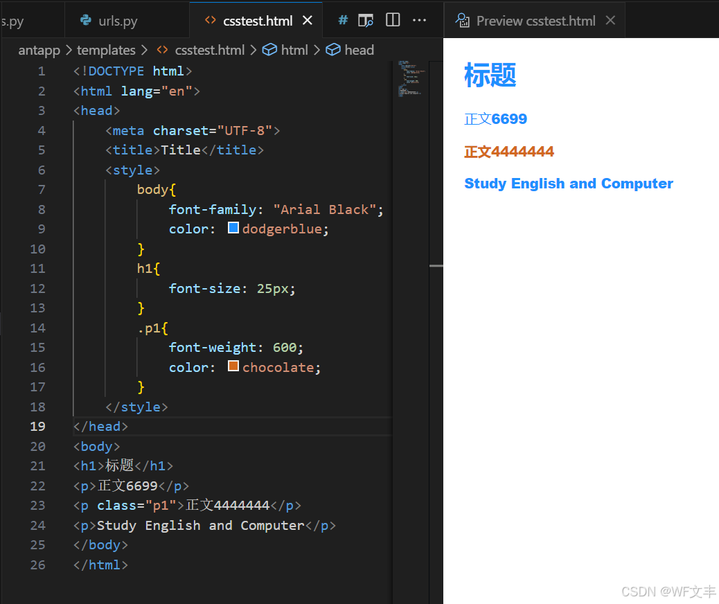
<!DOCTYPE html>
<html lang="en">
<head>
    <meta charset="UTF-8">
    <title>Title</title>
    <style>
        body{
            font-family: "Arial Black";
            color: dodgerblue;
        }
        h1{
            font-size: 25px;
        }
        .p1{
            font-weight: 600;
            color: chocolate;
        }
    </style>
</head>
<body>
<h1>标题</h1>
<p>正文6699</p>
<p class="p1">正文4444444</p>
<p>Study English and Computer</p>
</body>
</html>
文本样式
颜色:color:agb / rgba()
文本对齐方式:text-align:center
首行缩进:text-indent:2em
行高:line-height:300px
下划线:text-decoration
<!DOCTYPE html>
<html lang="en">
<head>
<meta charset="UTF-8">
<title>Title</title>
<style>
h1{
color: rgba(0,255,255,0.9);
text-align: center;
}
.p1{
text-indent:2em;
}
.p3{
line-height:300px;
background: mediumaquamarine;
height: 300px;
}
/*下划线*/
.l1{
text-decoration: underline;
}
/*中划线*/
.l2{
text-decoration: line-through;
}
/*上划线*/
.l3{
text-decoration: overline;
}
/*超链接去下划线*/
a{
text-decoration: none;
}
</style>
</head>
<body>
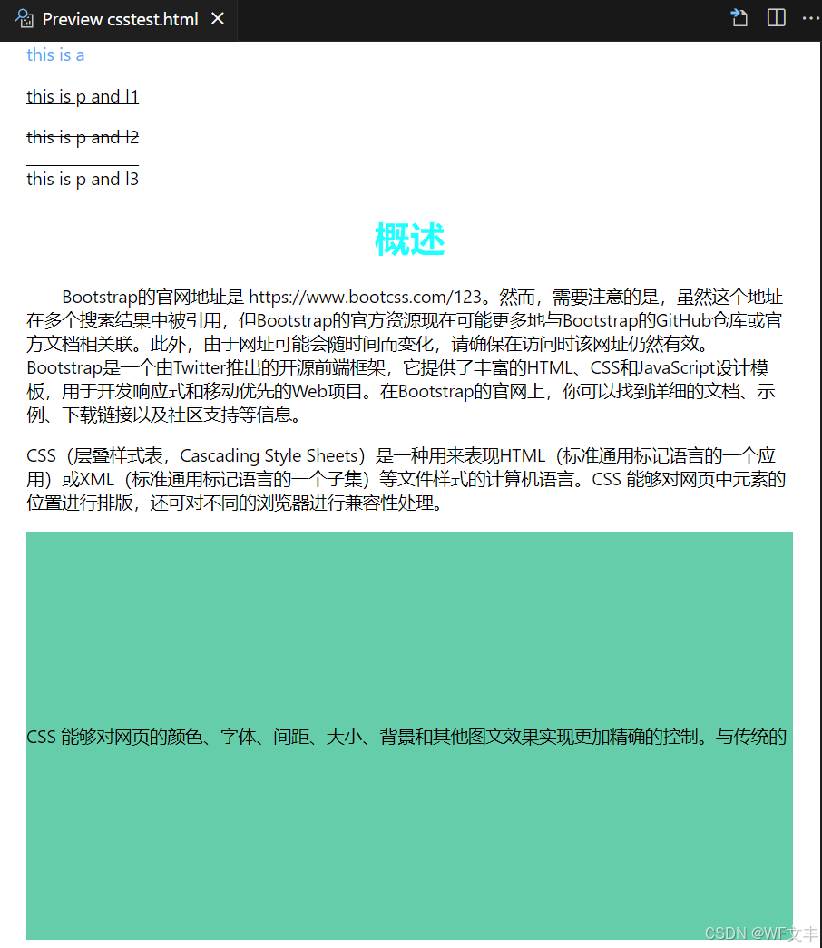
<a href="">this is a</a>
<p class="l1">this is p and l1</p>
<p class="l2">this is p and l2</p>
<p class="l3">this is p and l3</p>
<h1>概述</h1>
<p class="p1">
Bootstrap的官网地址是 https://www.bootcss.com/123。然而,需要注意的是,虽然这个地址在多个搜索结果中被引用,但Bootstrap的官方资源现在可能更多地与Bootstrap的GitHub仓库或官方文档相关联。此外,由于网址可能会随时间而变化,请确保在访问时该网址仍然有效。
Bootstrap是一个由Twitter推出的开源前端框架,它提供了丰富的HTML、CSS和JavaScript设计模板,用于开发响应式和移动优先的Web项目。在Bootstrap的官网上,你可以找到详细的文档、示例、下载链接以及社区支持等信息。
</p>
<p>
CSS(层叠样式表,Cascading Style Sheets)是一种用来表现HTML(标准通用标记语言的一个应用)或XML(标准通用标记语言的一个子集)等文件样式的计算机语言。CSS 能够对网页中元素的位置进行排版,还可对不同的浏览器进行兼容性处理。
</p>
<p class="p3">
CSS 能够对网页的颜色、字体、间距、大小、背景和其他图文效果实现更加精确的控制。与传统的HTML表现方式相比,CSS能够使网页的表现与内容分离,提高网页的加载速度,增强页面的可维护性,并且使得页面的布局更加灵活多样。
</p>
</body>
</html>
阴影
/*阴影的颜色,水平偏移,垂直偏移,阴影半径*/
#price{
    text-shadow: deepskyblue 10px 10px 2px;
}
超链接伪类
/*默认的颜色*/
a{
    text-decoration: none;
    color: #000000;
}
/*鼠标悬浮的状态(只需要记住)*/
a:hover{
    color: orange;
    font-size: 50px;
}
列表
/*ul li*/
/*circle 空心圆
  decimal 数字
  square 正方形*/
/*ul li*/
ul {
    background: grey;
}
ul li{
    height: 30px; /*行高*/
    list-style: none; /*去掉圆点*/
    text-indent: 1em;
}
背景
背景颜色:background
background-image:url(“”); /* 默认是全部平铺的 /
background-repeat:repeat-x; / 水平平铺 /
background-repeat:repeat-y; / 垂直平铺 /
background-repeat:no-repeat; / 不平铺 */
背景图片
<!DOCTYPE html>
<html lang="en">
<head>
    <meta charset="UTF-8">
    <title>Title</title>
    <style>
        div{
            width: 1000px;
            height: 700px;
            border: 1px solid red;
            background-image: url("images/ceshi.jpeg");
            /*默认是全部平铺的*/
        }
        .div1{
            background-repeat: repeat-x;
        }
        .div2{
            background-repeat: repeat-y;
        }
        .div3{
            background-repeat: no-repeat;
        }
    </style>
</head>
<body>
<div class="div1"></div>
<div class="div2"></div>
<div class="div3"></div>
</body>
</html>
渐变背景网址:https://www.baidu.com
径向渐变、圆形渐变
```html
<!DOCTYPE html>
<html lang="en">
<head>
<meta charset="UTF-8">
<title>背景</title>
<style>
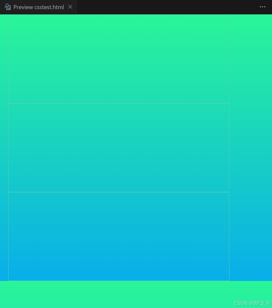
body{
background-color: #08AEEA;
background-image: linear-gradient(0deg, #08AEEA 0%, #2AF598 100%);
}
div{
width: 500px;
height: 200px;
border: 1px solid mediumaquamarine;
background-image: url("img/str.png");
/* 默认是全部平铺的 */
}
/*水平平铺*/
.div1{
background-repeat: repeat-x;
}
/*垂直平铺*/
.div2{
background-repeat: repeat-y;
}
/*不平铺*/
.div3{
background-repeat: no-repeat;
}
</style>
</head>
<body>
<div class="div1"></div>
<div class="div2"></div>
<div class="div3"></div>
</body>
</html>
盒子模型
-
什么是盒子模型
margin:外边距
padding:内边距
border:边框 -
边框
边框的粗细
边框的样式
边框的颜色
/* 边框大小 边框样式 边框颜色 */
border: 1px solid #000000;
- 内外边距
margin:外边距
padding:内边距
/*
    当margin/padding
    有一个参数,上下左右,都有边距
    有二个参数,上下,左右,表示
    四个参数时,上,右,下,左,表示
*/
 margin:0 1px 2px 3px;
盒子的计算方式:元素到底多大?
margin+border+padding+内容宽度
- 圆角边框
4个角
div{
    width: 100px;
    height: 50px;
    margin: 30px;
    border: 2px solid red;
    border-radius: 50px 50px 0px 0px; /* 和边距的参数一样,左上,右上,右下,左下 */
}
- 阴影
/*
h-shadow    必需。水平阴影的位置。允许负值。
v-shadow    必需。垂直阴影的位置。允许负值。
blur    可选。模糊的距离。
color    可选。阴影的颜色。
*/
text-shadow: h-shadow v-shadow blur color;
浮动
- 标准文档流
块级元素:独占一行
行内元素:不独占一行
注意:块级元素可以存在行内元素。
- display
block:块元素;
inline:行内元素;
inline-block:是块元素,但是可以内联,在一行;
这也是一种实现行内元素排列的方式,但是我们很多情况用float。
<!DOCTYPE html>
<html lang="en">
<head>
    <meta charset="UTF-8">
    <title>dispaly</title>
    <style>
        /*
        block: 块元素
        inline: 行内元素
        inline-block: 块元素,但是可以内联
        none: 隐藏
        */
        div{
            width: 100px;
            height: 100px;
            border: 1px solid darkorange;
            display: inline-block;
        }
        span{
            width: 100px;
            height: 100px;
            border: 1px solid darkorange;
            display: inline-block;
        }
    </style>
</head>
<body>
<div>div块元素</div>
<span>span行内元素</span>
</body>
</html>
- float
左右浮动
浮动的元素会脱离标准流
div{
    float: right;/*向右浮动*/
}
- 父级边框塌陷问题
/*
clear: right; 右侧不允许有浮动元素
clear: left;  左侧不允许有浮动元素
clear: both;  两侧不允许有浮动元素
clear: none;  不允许有浮动元素
*/
.text{
    clear:both;
}
解决父级边框塌陷问题:
增加父级元素高度
#body{
    border: 1px #000 solid;
    height: 800px;
}
增加一个空的div标签,清除浮动
<div class="clear"></div>
.clear{
    clear: both;
    margin: 0;
    padding: 0;
}
父类添加一个伪类:after
#body:after{
    content: '';
    display: block;
    clear: both;
}
定位
相对定位:positon:relstive;
相对于原来的位置,进行指定的偏移,相对定位的话,它仍然在标准文档流中!原来的位置会被保留。
top:-20px; /* 向上偏移20px */
left:20px; /* 向右偏移20px */
bottom:10px; /* 向上偏移10px */
right:20px; /* 向左偏移20px */
定位:基于xxx定位,上下左右
没有父级元素定位的前提下,相对于游览器定位
假设父级元素村咋i定位,我们通常会相对于父级元素进行便宜
在父级元素范围内移动
相对于父级或者游览器的位置,进行指定的偏移,绝对定位后,它仍然在标准文档流中,原来的位置不会被保留
div{
  position: absolute;/*绝对定位*/
  top: -20px;/*相对当前的位置 向上移动,负值相反方向*/
  left: 20px;/*相对当前的位置 向右移动*/
}
固定定位使元素的位置相对于浏览器窗口来定位
即使窗口是滚动的它也不会移动
div{
    position: fixed;/*固定定位*/
    right: 0;
    bottom: 0;
}
图层,用定位的时候会产生会和其他元素重叠
相当于上一层盖住了下一层的内容
div{
    z-index:2;
}
<!DOCTYPE html>
<html lang="en">
<head>
    <meta charset="UTF-8">
    <title>Title</title>
<style>
div{
    width:100px;
    height:100px;
    background:red;
    animation:myfirst 5s; /* 动画执行时间 */
}
@keyframes myfirst{
    0%   {background: red;}
    25%  {background: yellow;}
    50%  {background: blue;}
    100% {background: green;}
}
</style>
</head>
<body>
    <div></div>
</body>
</html>