创建uni项目什么的就不说啦,这里直接进入正题~
1.新建一个与 pages同级的文件夹目录 components ,用来放置我们的tabbar文件:
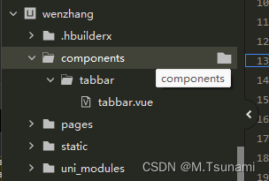
2.编写自定义tabbar.vue
<template>
<view class="tabbar-container">
<block style="margin-top: 200rpx;">
<view class="tabbar-item" v-for="(item, index) in tabbarList"
:class="[item.centerItem ? ' center-item' : '']" @click="changeItem(item)">
<view>
<view class="item-top">
<image :src="currentItem == item.id ? item.selectIcon : item.icon"></image>
</view>
</view>
<view class="item-bottom" :class="[currentItem == item.id ? 'item-active' : '']">
<text>{{ item.text }}</text>
</view>
</view>
</block>
</view>
</template>
<script>
export default {
props: {
currentPage: {
type: Number,
default: 0
}
},
data() {
return {
currentItem: 0,
tabbarList: [{
id: 0,
path: '/pages/index/index',
icon: '../../static/iconsvg/home-no.svg',
selectIcon: "../../static/iconsvg/home.svg",
text: '首页',
centerItem: false
},
{
id: 1,
path: '/pages/order/order',
icon: '../../static/iconsvg/dating-no.svg',
selectIcon: '../../static/iconsvg/dating.svg',
text: '服务大厅',
centerItem: false
},
{
id: 2,
path: '/pages/upGoodInfo/upGoodInfo',
icon: '../../static/iconsvg/fabu.svg',
selectIcon: '../../static/iconsvg/fabu.svg',
text: '发布',
centerItem: true
},
{
id: 3,
path: '/pages/connection/connection',
icon: '../../static/iconsvg/txl-no.svg',
selectIcon: '../../static/iconsvg/txl.svg',
text: '通讯录',
centerItem: false
},
{
id: 4,
path: '/pages/person/person',
icon: '../../static/iconsvg/my-no.svg',
selectIcon: '../../static/iconsvg/my.svg',
text: '我的',
centerItem: false
}
]
};
},
mounted() {
this.currentItem = this.currentPage;
uni.hideTabBar();
},
methods: {
changeItem(item) {
let _this = this;
console.log(item.path)
if (item.id == 2) {
uni.reLaunch({
url: item.path
})
}
uni.reLaunch({
url: item.path
});
}
}
};
</script>
<style scoped>
view {
padding: 0;
margin: 0;
box-sizing: border-box;
background-color: #fff;
}
.tabbar-container {
position: fixed;
bottom: 0;
left: 0;
width: 100%;
height: 146rpx;
box-shadow: 0 0 5px #999;
display: flex;
align-items: flex-start;
padding: 5rpx 0;
color: #999999;
}
.tabbar-container .tabbar-item {
width: 20%;
height: 100rpx;
display: flex;
flex-direction: column;
justify-content: center;
align-items: center;
text-align: center;
}
.tabbar-container .item-active {
color: #22b9ff;
}
.tabbar-container .center-item {
display: block;
position: relative;
}
.tabbar-container .tabbar-item .item-top {
width: 70rpx;
height: 70rpx;
padding: 10rpx;
}
.tabbar-container .center-item .item-top {
flex-shrink: 0;
width: 100rpx;
height: 100rpx;
position: absolute;
top: -50rpx;
left: calc(50% - 50rpx);
border-radius: 50%;
box-shadow: 0 0 5px #999;
}
.tabbar-container .tabbar-item .item-top image {
width: 100%;
height: 100%;
}
.tabbar-container .tabbar-item .item-bottom {
font-size: 28rpx;
width: 100%;
}
.tabbar-container .center-item .item-bottom {
position: absolute;
bottom: 5rpx;
}
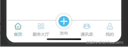
</style>注意 :icon 和 selectIcon 的图标地址不要引用错哦
3.找到我们的入口文件 main.js ,引用写好的tabbar
import tabbar from "components/tabbar/tabbar.vue"
Vue.component('tabbar',tabbar)
注意 : 要写在 import Vue from 'vue' 之后哦
4.在每个tabbar页面的 template 的最后一行加上tabbar组件
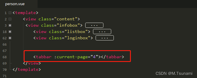
注意 : 这里的tabbar组件名需和在 main.js 中注册的一样
:current-page 指的是当前页面的id索引值,比如,如果是首页的话,:current-page="0"
这样,我们的自定义tabbar就设置完成啦!