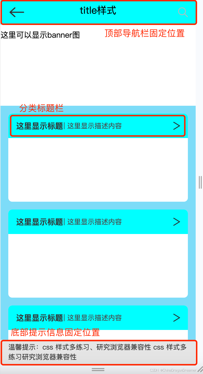
一、效果图
页面body的css代码
body {
	position: absolute;
	width: 100%;
	height: 100vh;
	padding: 0;
	margin: 0;
	top: 0;
	left: 0;
	bottom: 0;
	background-color #eee;
	/* overflow: auto;
	overflow-y: scroll; */

	/* ::-webkit-scrollbar {
		display: none;
	} */
}

.content-root {
	width: 100%;
	height: 100vh;
	top: 0;
	left: 0;
	position: absolute;
	padding-bottom: 2.5rem;
	background-color: #7ddcf8;
}
二、顶部导航栏固定位置
页面内容可以上下滑动,顶部导航栏始终固定显示在顶部
css代码
.tool-bar {
	width: 100%;
	height: 3.125rem;
	display: flex;
	/* 固定位置 */
	position: fixed;
	background-color: aqua;
	padding-left: 1rem;
	padding-bottom: 0.9375rem;
	/* 数值越大,表示越会显示在其他堆叠元素之上 */
	z-index: 999;
	align-items: flex-end;
	justify-content: space-between;
	box-sizing: border-box;
}

.back-img {
	width: 1.875rem;
	height: 1.25rem;
	margin-left: 0.16rem;
}

.title {
	position: absolute;
	font-family: PingFangSC, PingFang SC;
	font-size: 1.25rem;
	left: 50%;
	transform: translate(-50%, 0);
	text-align: center;
}

.search {
	position: absolute;
	right: 1rem;
	width: 1.25rem;
	height: 1.25rem;
}
三、分类标题栏
一般项目首页分类列表里的item会显示该类型的标题和一行描述,右边显示icon表示点击可查看更多
css代码
.list-root {
	/* 100%的宽度,减去左右边距的总和 */
	width: calc(100% - 32px);
	height: 11.25rem;
	position: relative;
	margin-top: 1rem;
	margin-left: 1rem;
	/* 左右边距 这里注释掉因为 上面 margin-top, 具体根据实际页面样式进行设置 */
	/* margin: 0 16px; */
	border-radius: 0.5rem;
	background-color: white;
}

.top-type {
	width: 100%;
	height: 3.125rem;
	background-color: aqua;
	border-top-left-radius: 0.5rem;
	border-top-right-radius: 0.5rem;
	background-size: 100%;
	display: flex;
	align-items: center;
	justify-content: space-between;
	flex-wrap: wrap;
}

.type-name {
	margin-left: 1rem;
	font-size: 1rem;
	color: #333333;
	font-family: PingFangSC, PingFang SC;
	font-weight: bold;
	padding: 0;
	text-align: left;
	font-style: normal;
}

.type-desc {
	font-family: PingFangSC, PingFang SC;
	font-weight: 400;
	font-size: 0.875rem;
	margin-left: 0.08rem;
	color: #4a4a4a;
	text-align: left;
	overflow: hidden;
	font-style: normal;
	/* 占位剩余空间 */
	flex: 1;
	/*内容超过后面显示... */
	text-overflow: ellipsis;
	/* 不换行 */
	white-space: nowrap;
}

.type-arrow-img {
	width: 0.875rem;
	height: 1rem;
	margin-right: 1rem;
}
四、底部提示文案固定位置
金融类的项目,一般在首页或者下单页面可以上下滑动,提醒用户的文案固定在底部。
css代码
.bottom-tip {
	width: 100%;
	height: 3.125rem;
	bottom: 0;
	left: 0;
	position: fixed;
	padding-left: 1rem;
	padding-right: 1rem;
	/* 让元素变成一个盒模型, 解决 padding-right 不生效问题*/
	box-sizing: border-box;
	z-index: 999;
	font-size: 0.875rem;
	color: #333333;
	/* 内容居中 */
	display: flex;
	align-items: center;
	justify-content: center;
	background-color: #e5e5e5;
}
五、title.css完整代码
body {
	position: absolute;
	width: 100%;
	height: 100vh;
	padding: 0;
	margin: 0;
	top: 0;
	left: 0;
	bottom: 0;
	background-color #eee;
	/* overflow: auto;
	overflow-y: scroll; */

	/* ::-webkit-scrollbar {
		display: none;
	} */
}

.content-root {
	width: 100%;
	height: 100vh;
	top: 0;
	left: 0;
	position: absolute;
	padding-bottom: 2.5rem;
	background-color: #7ddcf8;
}

.content-top {
	width: 100%;
	height: 9.375rem;
	/* 如果需要让下面的内容覆盖在这上面,使用  position: absolute; */
	position: relative;
	background-color: white;
	padding-bottom: 4.125rem;
	align-items: center;
}


.tool-bar {
	width: 100%;
	height: 3.125rem;
	display: flex;
	/* 固定位置 */
	position: fixed;
	background-color: aqua;
	padding-left: 1rem;
	padding-bottom: 0.9375rem;
	/* 数值越大,表示越会显示在其他堆叠元素之上 */
	z-index: 999;
	align-items: flex-end;
	justify-content: space-between;
	box-sizing: border-box;
}

.back-img {
	width: 1.875rem;
	height: 1.25rem;
	margin-left: 0.16rem;
}

.title {
	position: absolute;
	font-family: PingFangSC, PingFang SC;
	font-size: 1.25rem;
	left: 50%;
	transform: translate(-50%, 0);
	text-align: center;
}

.search {
	position: absolute;
	right: 1rem;
	width: 1.25rem;
	height: 1.25rem;
}

.list-root {
	/* 100%的宽度,减去左右边距的总和 */
	width: calc(100% - 32px);
	height: 11.25rem;
	position: relative;
	margin-top: 1rem;
	margin-left: 1rem;
	/* 左右边距 这里注释掉因为 上面 margin-top, 具体根据实际页面样式进行设置 */
	/* margin: 0 16px; */
	border-radius: 0.5rem;
	background-color: white;
}

.top-type {
	width: 100%;
	height: 3.125rem;
	background-color: aqua;
	border-top-left-radius: 0.5rem;
	border-top-right-radius: 0.5rem;
	background-size: 100%;
	display: flex;
	align-items: center;
	justify-content: space-between;
	flex-wrap: wrap;
}

.type-name {
	margin-left: 1rem;
	font-size: 1rem;
	color: #333333;
	font-family: PingFangSC, PingFang SC;
	font-weight: bold;
	padding: 0;
	text-align: left;
	font-style: normal;
}

.type-desc {
	font-family: PingFangSC, PingFang SC;
	font-weight: 400;
	font-size: 0.875rem;
	margin-left: 0.08rem;
	color: #4a4a4a;
	text-align: left;
	overflow: hidden;
	font-style: normal;
	/* 占位剩余空间 */
	flex: 1;
	/*内容超过后面显示... */
	text-overflow: ellipsis;
	/* 不换行 */
	white-space: nowrap;
}

.type-arrow-img {
	width: 0.875rem;
	height: 1rem;
	margin-right: 1rem;
}

.bottom-tip {
	width: 100%;
	height: 3.125rem;
	bottom: 0;
	left: 0;
	position: fixed;
	padding-left: 1rem;
	padding-right: 1rem;
	/* 让元素变成一个盒模型, 解决 padding-right 不生效问题*/
	box-sizing: border-box;
	z-index: 999;
	font-size: 0.875rem;
	color: #333333;
	/* 内容居中 */
	display: flex;
	align-items: center;
	justify-content: center;
	background-color: #e5e5e5;
}
六、title.html完整代码
<!DOCTYPE html>
<html>
	<head>
		<meta charset="utf-8">
		<meta name="viewport" content="width=device-width, initial-scale=1.0, user-scalable=no" />
		<meta http-equiv="Content-Type" content="text/html; charset=utf-8" />
		<title></title>
		<link rel="stylesheet" href="../css/title.css" />
	</head>
	<body>
		<div class="content-root">
			<div class="content-top">
				<div class="tool-bar">
					<img class="back-img" src="../images/icon_title_back_black.png" />
					<span class="title">title样式</span>
					<img class="search" src="../images/icon_search.png" />
				</div>
				<div style="position: absolute; margin-top: 60px;">这里可以显示banner图</div>
			</div>

			<div class="list-root">
				<div class="top-type">
					<span class="type-name">这里显示标题</span>
					<span class="type-desc"> | 这里显示描述内容</span>
					<img class="type-arrow-img" src="../images/icon_arrow_right_black.png" />
				</div>
			</div>

			<div class="list-root">
				<div class="top-type">
					<span class="type-name">这里显示标题</span>
					<span class="type-desc"> | 这里显示描述内容</span>
					<img class="type-arrow-img" src="../images/icon_arrow_right_black.png" />
				</div>
			</div>

			<div class="list-root">
				<div class="top-type">
					<span class="type-name">这里显示标题</span>
					<span class="type-desc"> | 这里显示描述内容</span>
					<img class="type-arrow-img" src="../images/icon_arrow_right_black.png" />
				</div>
			</div>

			<div class="bottom-tip">
				温馨提示:css 样式多练习、研究浏览器兼容性 css 样式多练习研究浏览器兼容性
			</div>


		</div>
	</body>


</html>