css实现椭圆、半椭圆
参考自css实现椭圆、半椭圆
<!DOCTYPE html>
<html lang="en">
<head>
<meta charset="UTF-8">
<title>css实现椭圆、半椭圆</title>
<style>
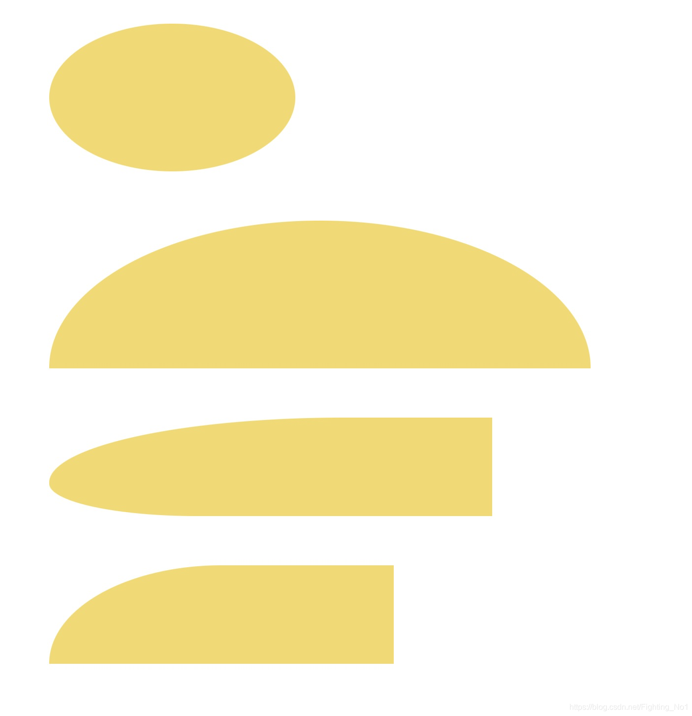
.ellipse {
width: 250px;
height: 150px;
margin: 50px;
background: #FFD900;
/*左上 右上 右下 左下*/
border-radius: 50% / 50%;
/*相当于:border-radius: 50%;*/
/*border-radius: 左上角水平圆角半径大小 右上角水平圆角半径大小 右下角水平圆角半径大小 左下角水平圆角半径大小/左上角垂直圆角半径大小 右上角垂直圆角半径大小 右下角垂直圆角半径大小 左下角垂直圆角半径大小*/
}
.ellipse1 {
width: 550px;
height: 150px;
margin: 50px;
background: #FFD900;
border-radius: 50% / 100% 100% 0 0;
}
.ellipse2 {
width: 450px;
height: 100px;
margin: 50px;
background: #FFD900;
border-radius: 100% 0 0 50%;
}
.ellipse3 {
width: 350px;
height: 100px;
margin: 50px;
background: #FFD900;
border-radius: 50% / 100% 0 0 0;
}
</style>
</head>
<body>
<div class="ellipse"></div>
<div class="ellipse1"></div>
<div class="ellipse2"></div>
<div class="ellipse3"></div>
</body>
</html>
效果图如下: