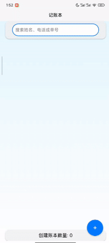
在开发账本应用的过程中,持续的样式优化对于提升用户体验起着至关重要的作用。本次账本 1.02 版本着重对样式进行了全面优化,让应用在视觉上更加美观、操作上更加便捷。下面就为大家分享一些关键代码及优化思路。话不多说,先上效果图。
一、整体布局优化
在index.vue和add.vue中,整体布局都采用了flex布局方式。以index.vue为例:
.container {
  display: flex;
  flex-direction: column;
  height: 100vh;
  justify-content: space-between;
  padding: 0 20px;
  background: linear-gradient(to bottom, #e6f7ff, #ffffff);
}通过flex-direction: column将页面元素垂直排列,height: 100vh使容器占满整个视口高度,justify-content: space-between确保元素在垂直方向上均匀分布,背景渐变则为页面增添了视觉层次感。
在add.vue中同样如此:
.container {
  display: flex;
  flex-direction: column;
  justify-content: space-between;
  height: 100vh;
  padding: 20px;
  background: linear-gradient(to bottom, #e6f7ff, #ffffff);
}
这种统一的布局方式,保证了整个应用界面风格的一致性,让用户在不同页面间切换时也能有连贯的操作体验。
二、输入框样式改进
- 搜索输入框:在
index.vue的搜索输入框部分,不仅添加了清晰的样式,还增强了交互效果。.search-input { padding: 10px; border: 2px solid #007AFF; border-radius: 25px; width: 80%; background-color: #ffffff; position: relative; }通过设置
border为2px solid #007AFF,突出输入框的轮廓,border-radius: 25px使其边角圆润,更具亲和力。width: 80%合理控制了输入框的宽度,background-color: #ffffff保证了输入框的清晰易读性。 - 普通输入框:
add.vue中的普通输入框样式也进行了优化。.input-box, .textarea-box { margin-bottom: 10px; border: 1px solid #007AFF; padding: 10px; border-radius: 15px; font-size: 16px; width: 95%; box-shadow: 0 2px 4px rgba(0, 0, 0, 0.1); background-color: white; animation: fadeIn 0.5s ease; }这里的输入框和文本域都设置了
border-radius: 15px的圆角,box-shadow: 0 2px 4px rgba(0, 0, 0, 0.1)添加了淡淡的阴影效果,使输入框看起来更有立体感。animation: fadeIn 0.5s ease则为输入框添加了淡入动画,增强了页面加载时的视觉效果。三、列表项样式增强
在
index.vue的列表部分,为了区分不同状态的列表项,使用了不同的背景颜色。<view v-for="(item, index) in filteredList" :key="index" class="item" :style="{ backgroundColor: item.status === '已完成'? 'lightgreen' : 'lightcoral' }" @animationend="animationEnd(index)" @longpress="confirmDelete(index)" >根据
item.status的值,已完成的列表项背景色为lightgreen,未完成的为lightcoral,这种直观的颜色区分,让用户能快速识别任务状态。同时,列表项还添加了box-shadow和animation效果。.item { padding: 10px; margin: 10px 0; border-radius: 20px; box-shadow: 0 4px 6px rgba(0, 0, 0, 0.1); background-color: white; animation: fadeIn 0.5s ease; transform-origin: top; position: relative; }box-shadow: 0 4px 6px rgba(0, 0, 0, 0.1)增加了列表项的立体感,animation: fadeIn 0.5s ease让列表项在加载时以淡入的动画效果呈现,提升了用户体验。四、按钮样式优化
- 创建按钮:在
index.vue中,创建按钮采用了圆形样式,并添加了动画效果。.create-button { position: fixed; right: 30px; bottom: 20px; display: flex; justify-content: center; align-items: center; background-color: #007AFF; color: white; border: none; border-radius: 50%; width: 60px; height: 60px; font-size: 24px; box-shadow: 0 2px 4px rgba(0, 0, 0, 0.2); animation: scaleIn 0.5s ease; }border-radius: 50%使按钮变成圆形,background-color: #007AFF搭配color: white,颜色鲜明,易于识别。animation: scaleIn 0.5s ease添加了缩放进入的动画效果,让按钮在页面加载时更加醒目。 - 操作按钮:
add.vue中的取消和保存按钮也进行了样式优化。.cancel-button, .save-button { padding: 10px; border: none; border-radius: 15px; font-size: 16px; width: 49%; box-shadow: 0 2px 4px rgba(0, 0, 0, 0.1); } .cancel-button { background-color: lightcoral; color: white; } .save-button { background-color: lightgreen; color: white; }按钮设置了
border-radius: 15px的圆角,box-shadow: 0 2px 4px rgba(0, 0, 0, 0.1)增加立体感,不同的背景颜色(lightcoral和lightgreen)用于区分取消和保存操作,让用户能快速做出选择。通过这些样式优化,账本 1.01 版本在界面美观度和用户交互体验上都有了显著提升。希望这些代码分享能对大家在开发类似应用时有所帮助,欢迎大家交流讨论,一起探索更多优化方案。