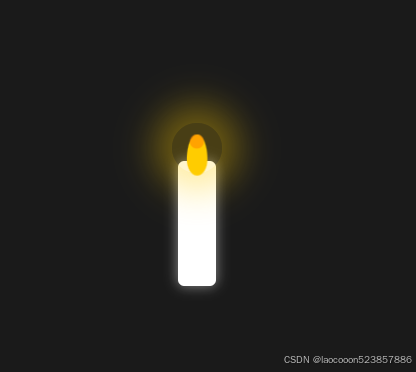
<!DOCTYPE html>
<html lang="en">
<head>
    <meta charset="UTF-8">
    <meta name="viewport" content="width=device-width, initial-scale=1.0">
    <title>Candle Effect</title>
    <style>
        body {
            display: flex;
            justify-content: center;
            align-items: center;
            height: 100vh;
            margin: 0;
            background-color: #1a1a1a;
        }

        .candle {
            position: relative;
            width: 30px;
            height: 100px;
            background-color: #fff;
            border-radius: 5px;
            box-shadow: 0 0 10px rgba(255, 255, 255, 0.5);
        }

        .flame {
            position: absolute;
            top: -20px;
            left: 50%;
            transform: translateX(-50%);
            width: 15px;
            height: 30px;
            background-color: #ffcc00;
            border-radius: 50% 50% 50% 50% / 60% 60% 40% 40%;
            animation: flicker 0.1s infinite alternate;
        }

        .flame::before {
            content: '';
            position: absolute;
            top: 0;
            left: 50%;
            transform: translateX(-50%);
            width: 10px;
            height: 10px;
            background-color: #ff6600;
            border-radius: 50%;
            opacity: 0.5;
        }

        @keyframes flicker {
            0% {
                transform: translateX(-50%) scale(1);
            }
            100% {
                transform: translateX(-50%) scale(1.1);
            }
        }

        .glow {
            position: absolute;
            top: -30px;
            left: 50%;
            transform: translateX(-50%);
            width: 40px;
            height: 40px;
            background-color: rgba(255, 204, 0, 0.2);
            border-radius: 50%;
            animation: glow 1s infinite alternate;
        }

        @keyframes glow {
            0% {
                box-shadow: 0 0 20px 10px rgba(255, 204, 0, 0.2);
            }
            100% {
                box-shadow: 0 0 30px 15px rgba(255, 204, 0, 0.4);
            }
        }
    </style>
</head>
<body>
    <div class="candle">
        <div class="flame"></div>
        <div class="glow"></div>
    </div>
</body>
</html>