Material是一套设计风格,提供了大量的小部件,这里用Material风格搭建一个常见的应用页面结构。
创建Material应用
import 'package:flutter/material.dart';
class App extends StatelessWidget {
Widget build(BuildContext context) {
return MaterialApp(
debugShowCheckedModeBanner: false, // 关闭debug条幅
home: Center(
child: Text("首页"),
),
);
}
}
这里实例化的MaterialApp,而不是一般的Center Widget。
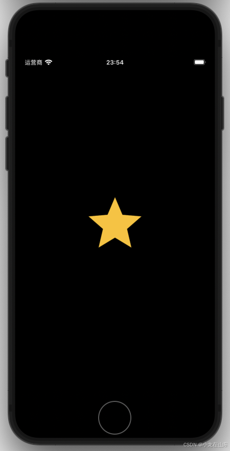
使用图表 Icon
import 'package:flutter/material.dart';
class App extends StatelessWidget {
Widget build(BuildContext context) {
return MaterialApp(
debugShowCheckedModeBanner: false, // 关闭debug条幅
home: Center(
child: Icon(
Icons.star,
color: Colors.amber,
size: 128,
),
),
);
}
}
这里用到了Icon
所有Icons:https://fonts.google.com/icons
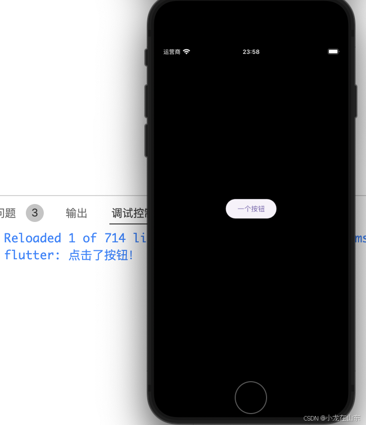
使用按钮 ElevatedButton
Flutter 提供了多种按钮小部件,这里ElevatedButton以为例。
import 'package:flutter/material.dart';
class App extends StatelessWidget {
Widget build(BuildContext context) {
return MaterialApp(
debugShowCheckedModeBanner: false, // 关闭debug条幅
home: Center(
child: ElevatedButton(
onPressed: () {
print("点击了按钮!");
},
child: Text("一个按钮"))),
);
}
}
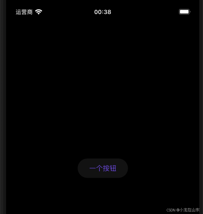
切换主题
定义两个主题样式
在app/themes/app_theme.dart下定义两个主题样式:一个浅色,一个深色。
import 'package:flutter/material.dart';

class AppTheme {
  static ThemeData light = ThemeData(
      primaryColor: Colors.deepPurpleAccent,
      colorScheme: ColorScheme.light(
        primary: Colors.deepPurpleAccent,
        secondary: Colors.amber,
      ));
  static ThemeData dark = ThemeData(
      primaryColor: Colors.deepPurpleAccent,
      colorScheme: ColorScheme.dark(
        primary: Colors.cyan,
        secondary: Colors.amber,
      ));
}
调用主题样式
用MaterialApp的theme和darkTheme分别调用浅色和深色主题样式。
import 'package:flutter/material.dart';
import 'package:package_name/app/themes/app_theme.dart';
class App extends StatelessWidget {
Widget build(BuildContext context) {
return MaterialApp(
debugShowCheckedModeBanner: false, // 关闭debug条幅
theme: AppTheme.light,
darkTheme: AppTheme.dark,
home: Center(
child: ElevatedButton(
onPressed: () {
print("点击了按钮!");
},
child: Text("一个按钮"))),
);
}
}
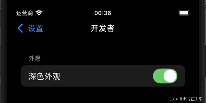
在IOS的设置-开发者里设置深色外观:
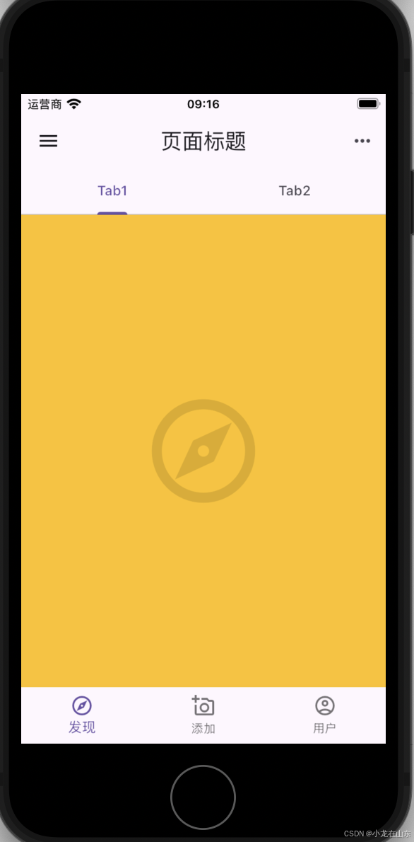
Scaffold 页面结构
使用Scaffold小部件可以得到一个Material风格的页面结构,可以设置页面头部工具栏、页面主体、页面底部的导航栏、侧边抽屉、底部侧板、浮动按钮等。
import 'package:flutter/material.dart';
class App extends StatelessWidget {
Widget build(BuildContext context) {
return MaterialApp(
debugShowCheckedModeBanner: false,
home: DefaultTabController(
// 设置默认Tab控制器
length: 2,
child: Scaffold(
backgroundColor: Colors.amber,
// 页面主体
body: TabBarView(children: [
Icon(
Icons.explore_outlined,
size: 128,
color: Colors.black12,
),
Icon(
Icons.local_fire_department,
size: 128,
color: Colors.black12,
),
]),
appBar: AppBar(
title: Text("页面标题"),
leading: IconButton(
onPressed: () {
print("这是导航菜单");
},
icon: Icon(Icons.menu)),
actions: [
IconButton(
onPressed: () {
print("这是Action位置");
},
icon: Icon(Icons.more_horiz))
],
bottom: TabBar(tabs: [
// 设置标签栏
Tab(
text: 'Tab1',
),
Tab(
text: 'Tab2',
)
]),
),
bottomNavigationBar: BottomNavigationBar(items: [
BottomNavigationBarItem(
icon: Icon(Icons.explore_outlined), label: "发现"),
BottomNavigationBarItem(
icon: Icon(Icons.add_a_photo_outlined), label: "添加"),
BottomNavigationBarItem(
icon: Icon(Icons.account_circle_outlined), label: "用户")
]),
),
));
}
}
如果是VSCode编辑器,在StatelessWidget上按快捷键Ctrl/Command+.,执行Convert to StatefulWidget命令,可以把无状态小部件转换成有状态小部件。
import 'package:flutter/material.dart';
class App extends StatefulWidget {
State<App> createState() => _AppState();
}
class _AppState extends State<App> {
Widget build(BuildContext context) {
return MaterialApp()
}
}
有状态小部件多出一个_AppState状态类,用于管理状态,通过createState、setState来创建和设置状态。
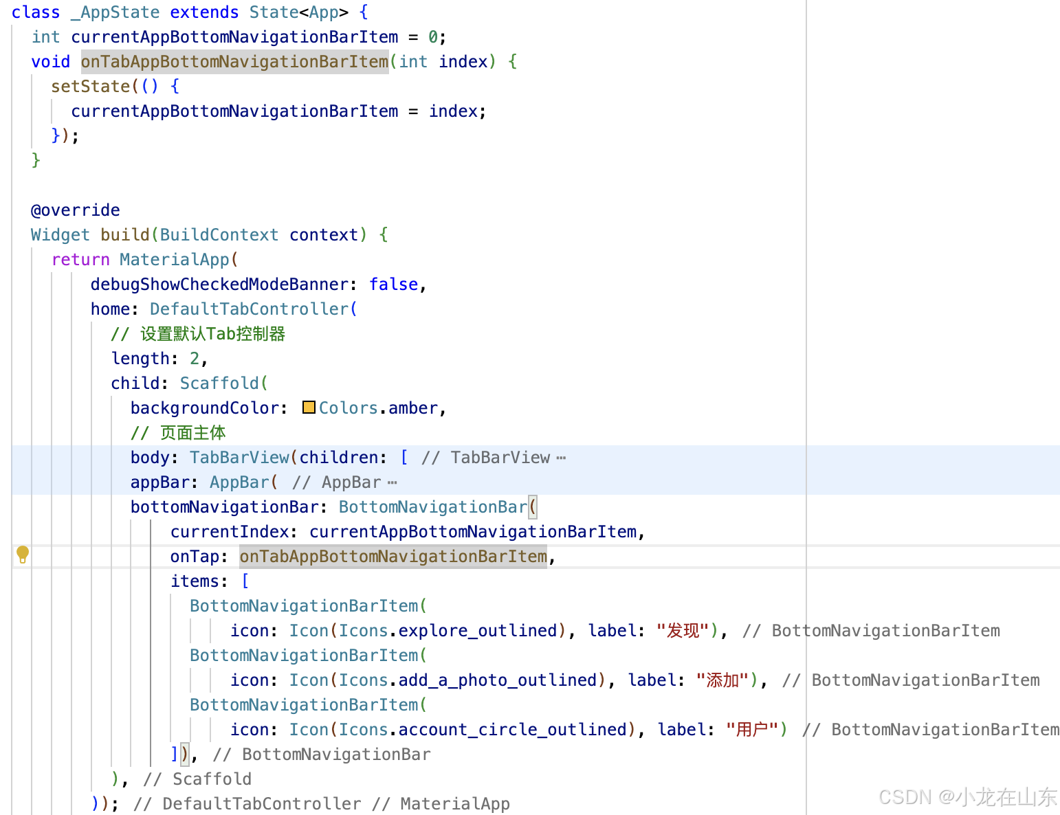
激活底部导航
import 'package:flutter/material.dart';
class App extends StatefulWidget {
State<App> createState() => _AppState();
}
class _AppState extends State<App> {
int currentAppBottomNavigationBarItem = 0;
void onTabAppBottomNavigationBarItem(int index) {
setState(() {
currentAppBottomNavigationBarItem = index;
});
}
Widget build(BuildContext context) {
return MaterialApp(
debugShowCheckedModeBanner: false,
home: DefaultTabController(
// 设置默认Tab控制器
length: 2,
child: Scaffold(
backgroundColor: Colors.amber,
// 页面主体
body: TabBarView(children: [
Icon(
Icons.explore_outlined,
size: 128,
color: Colors.black12,
),
Icon(
Icons.local_fire_department,
size: 128,
color: Colors.black12,
),
]),
appBar: AppBar(
title: Text("页面标题"),
leading: IconButton(
onPressed: () {
print("这是导航菜单");
},
icon: Icon(Icons.menu)),
actions: [
IconButton(
onPressed: () {
print("这是Action位置");
},
icon: Icon(Icons.more_horiz))
],
bottom: TabBar(tabs: [
// 设置标签栏
Tab(
text: 'Tab1',
),
Tab(
text: 'Tab2',
)
]),
),
bottomNavigationBar: BottomNavigationBar(
currentIndex: currentAppBottomNavigationBarItem,
onTap: onTabAppBottomNavigationBarItem,
items: [
BottomNavigationBarItem(
icon: Icon(Icons.explore_outlined), label: "发现"),
BottomNavigationBarItem(
icon: Icon(Icons.add_a_photo_outlined), label: "添加"),
BottomNavigationBarItem(
icon: Icon(Icons.account_circle_outlined), label: "用户")
]),
),
));
}
}
点击底部导航,切换显示小部件
  final pageMain = [
    TabBarView(children: [
      Icon(
        Icons.explore_outlined,
        size: 128,
        color: Colors.black12,
      ),
      Icon(
        Icons.local_fire_department,
        size: 128,
        color: Colors.black12,
      ),
    ]),
    Center(
      child: Icon(
        Icons.add_a_photo_outlined,
        size: 128,
        color: Colors.black12,
      ),
    ),
    Center(
      child: Icon(
        Icons.account_circle_outlined,
        size: 128,
        color: Colors.black12,
      ),
    )
  ];
首先定义三个小部件列表,然后在body里按照索引来调用。
body: pageMain.elementAt(currentAppBottomNavigationBarItem),
动态显示或隐藏AppBar
用showAppBar来决定是否显示appBar。
class _AppState extends State<App> {
  // 是否显示应用栏
  bool showAppBar = true;

  int currentAppBottomNavigationBarItem = 0;
  void onTabAppBottomNavigationBarItem(int index) {
    setState(() {
      currentAppBottomNavigationBarItem = index;
      // 第一个显示,其他不显示
      showAppBar = index == 0;
    }
appBar: showAppBar ? AppBar(...) : null,
appBar设置为null,就是隐藏。
FloatingActionButton 漂浮动作按钮
floatingActionButton: FloatingActionButton(
onPressed: () {
  print('这是漂浮动作按钮。');
},
child: Icon(Icons.share_outlined),
backgroundColor: Colors.black,
foregroundColor: Colors.white,
)
用Scaffold的floatingActionButton参数,可以设置漂浮动作按钮。
定义部件
上面的小部件都是放在一起,我们还可以把一些把页面的部分小部件单独放到一个文件里,这里以appBar为例:
app_page_header.dart
import 'package:flutter/material.dart';
class AppPageHeader extends StatelessWidget implements PreferredSizeWidget {
final Size preferredSize = Size.fromHeight(100);
Widget build(BuildContext context) {
return AppBar(
title: Text("页面标题"),
leading: IconButton(
onPressed: () {
print("这是导航菜单");
},
icon: Icon(Icons.menu)),
actions: [
IconButton(
onPressed: () {
print("这是Action位置");
},
icon: Icon(Icons.more_horiz))
],
bottom: TabBar(tabs: [
// 设置标签栏
Tab(
text: 'Tab1',
),
Tab(
text: 'Tab2',
)
]),
);
}
}
这里单独定义了一个AppPageHeader的类,作为appBar,然后我们就可以调用它了。
import 'package:package_name/app/components/app_page_header.dart';

appBar: showAppBar ? AppPageHeader() : null,
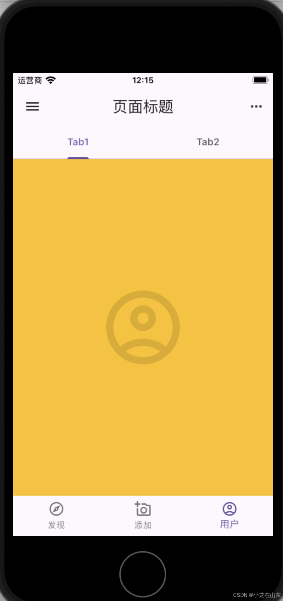
BottomSheet 底部面板
这里点击浮动按钮显示底部面板,把浮动按钮单独封装成了一个单独的文件app_floating_action_button.dart:
import 'package:flutter/material.dart';
class AppFloatingActionButton extends StatelessWidget {
Widget build(BuildContext context) {
return FloatingActionButton(
onPressed: () {
print('这是漂浮动作按钮。');
showBottomSheet(
context: context,
builder: (BuildContext context) {
return SizedBox.expand(
child: Center(
child: Column(
mainAxisAlignment: MainAxisAlignment.center,
mainAxisSize: MainAxisSize.min,
children: <Widget>[
const Text('漂浮动作按钮'),
ElevatedButton(
child: const Text('关闭'),
onPressed: () => Navigator.pop(context),
),
],
),
),
);
},
);
},
child: Icon(Icons.share_outlined),
backgroundColor: Colors.black,
foregroundColor: Colors.white,
);
}
}
调用:
floatingActionButton: AppFloatingActionButton(),
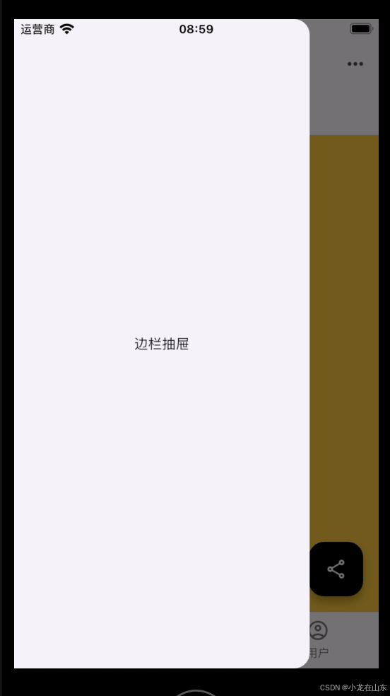
边栏抽屉
import 'package:flutter/material.dart';
class AppPageAside extends StatelessWidget {
Widget build(BuildContext context) {
return Drawer(
child: Center(
child: Text("边栏抽屉"),
),
);
}
}
在Scaffold函数里用drawer参数调用:
drawer: AppPageAside(),
AppBar leading 位置显示抽屉
onPressed: () {
  Scaffold.of(context).openDrawer();
},
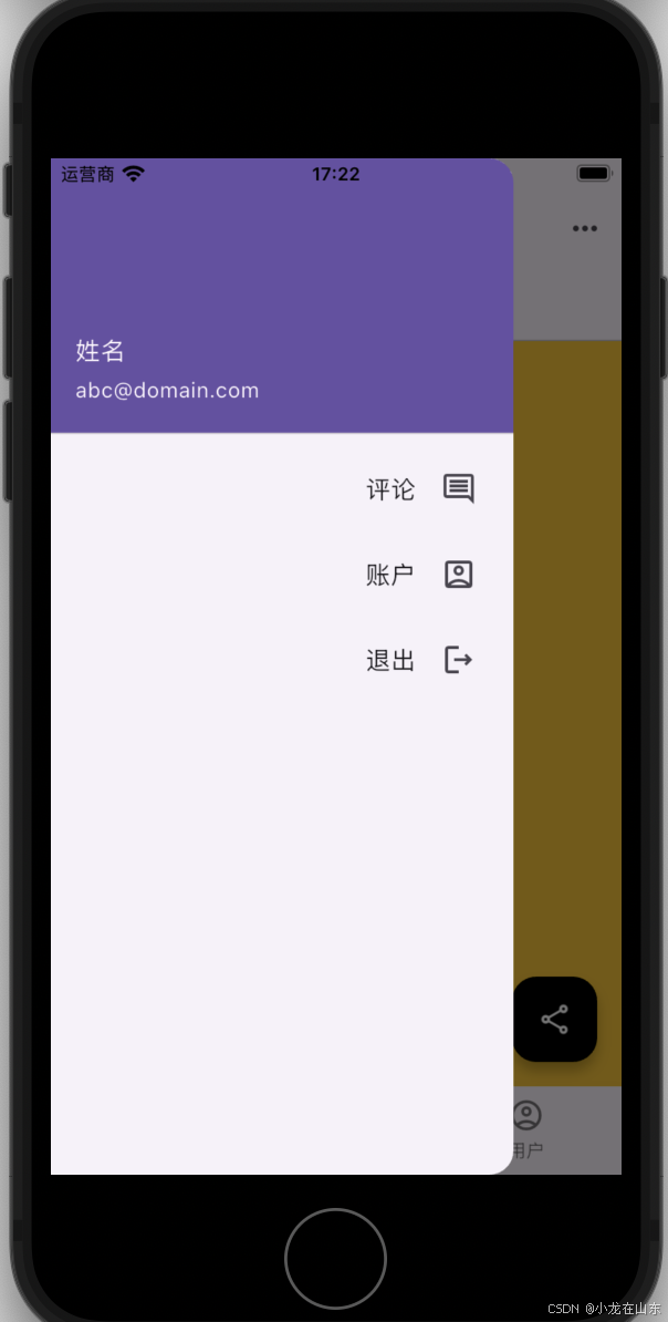
设置边栏抽屉显示的内容
import 'package:flutter/material.dart';
class AppPageAside extends StatelessWidget {
Widget build(BuildContext context) {
return Drawer(
child: Center(
child: ListView(
padding: EdgeInsets.zero,
children: [
UserAccountsDrawerHeader(
accountName: Text("姓名"), accountEmail: Text("[email protected]")),
ListTile(
title: Text(
"评论",
textAlign: TextAlign.right,
),
trailing: Icon(Icons.comment_outlined),
),
ListTile(
title: Text(
"账户",
textAlign: TextAlign.right,
),
trailing: Icon(Icons.account_box_outlined),
),
ListTile(
title: Text(
"退出",
textAlign: TextAlign.right,
),
trailing: Icon(Icons.logout_outlined),
),
],
),
),
);
}
}
弹出菜单
import 'package:flutter/material.dart';
class AppPageHeaderActionsMore extends StatelessWidget {
Widget build(BuildContext context) {
return PopupMenuButton(
itemBuilder: (context) => [
PopupMenuItem(
value: 'stack',
child: Icon(
Icons.view_agenda_outlined,
color: Colors.black12,
),
),
PopupMenuItem(
value: 'stack',
child: Icon(
Icons.dashboard_outlined,
color: Colors.black12,
),
),
],
icon: Icon(Icons.more_horiz),
offset: Offset(0, 50),
onCanceled: () {
print("弹出菜单按钮");
},
onSelected: (value) {
print("弹出菜单按钮的值是 $value");
},
);
}
}
AppBar(
......
    actions: [
    AppPageHeaderActionsMore(),
    ]
......