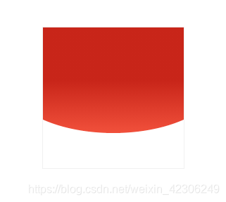
做下面背景图有两种方式:
<!DOCTYPE html>
<html lang="en">
<head>
    <meta charset="UTF-8">
    <meta http-equiv="X-UA-Compatible" content="IE=edge">
    <meta name="viewport" content="width=device-width, initial-scale=1.0">
    <title>Document</title>
    <style>
        .box1,.box2{
            position: relative;
            width: 200px;
            height: 200px;
            margin: 50px auto;
            border: 1px solid #f1f1f1;
            overflow: hidden;
        }
        .box1 .box{
            position: absolute;
            left: -25%;
            width: 150%;
            height: 150px;
            background-image: linear-gradient(0deg,#f1503b,#c82519 50%);
            border-bottom-left-radius: 100%;
            border-bottom-right-radius: 100%;
        }
        .box2 .box{
            width: 100%;
            height: 150px;
            padding: 0 25%;
            background-image: linear-gradient(0deg,#f1503b,#c82519 50%);
            border-bottom-left-radius: 100%;
            border-bottom-right-radius: 100%;
            transform: translate(-16.66%);   /* 注意这边宽度是100%,padding之后增加了其宽度,即 25/150 */
        }
    </style>
</head>
<body>
	<!-- 方法一 -->
    <div class="box1">
        <div class="box"></div>
    </div>
    <!-- 方法二 -->
    <div class="box2">
        <div class="box"></div>
    </div>
</body>
</html>