option = {
tooltip: {
trigger: 'axis',
axisPointer: {
type: 'cross',
crossStyle: {
color: '#999'
}
}
},
toolbox: {
feature: {
dataView: { show: true, readOnly: false },
magicType: { show: true, type: ['line', 'bar'] },
restore: { show: true },
saveAsImage: { show: true }
}
},
legend: {
data: ['Evaporation', 'Precipitation', 'Temperature']
},
xAxis: [
{
type: 'category',
data: ['Mon', 'Tue', 'Wed', 'Thu', 'Fri', 'Sat', 'Sun'],
axisPointer: {
type: 'shadow'
}
}
],
yAxis: [
{
type: 'value',
name: 'Precipitation',
min: 0,
max: 250,
interval: 50,
axisLabel: {
formatter: '{value} ml'
}
},
{
type: 'value',
name: 'Temperature',
min: 0,
max: 25,
interval: 5,
axisLabel: {
formatter: '{value} °C'
}
}
],
series: [
{
name: 'Evaporation',
type: 'bar',
tooltip: {
valueFormatter: function (value) {
return value + ' ml';
}
},
data: [
2.0, 4.9, 7.0, 23.2, 25.6, 76.7, 135.6, 162.2, 32.6, 20.0, 6.4, 3.3
]
},
{
name: 'Precipitation',
type: 'bar',
tooltip: {
valueFormatter: function (value) {
return value + ' ml';
}
},
data: [
2.6, 5.9, 9.0, 26.4, 28.7, 70.7, 175.6, 182.2, 48.7, 18.8, 6.0, 2.3
]
},
{
name: 'Temperature',
type: 'line',
yAxisIndex: 1,
tooltip: {
valueFormatter: function (value) {
return value + ' °C';
}
},
data: [2.0, 2.2, 3.3, 4.5, 6.3, 10.2, 20.3, 23.4, 23.0, 16.5, 12.0, 6.2]
}
]
};
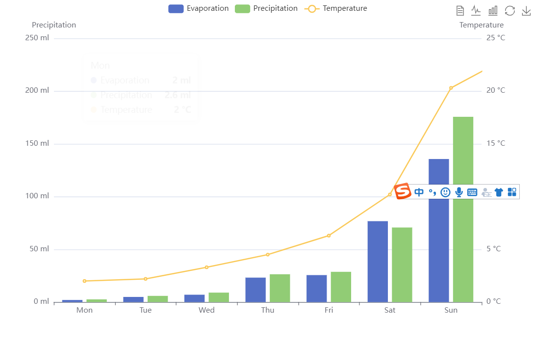
这里使用字符串模板进行设置,其中模板变量有{a}, {b}, {c}, {d},在不同图表类型下代表含义分别为
折线图、柱状图、K线图:{a} (系列名称)、{b}(类目值),{c}(数值),{d}(无)
散点图(气泡)图 : {a}(系列名称),{b}(数据名称),{c}(数值数组), {d}(无)
地图 : {a}(系列名称),{b}(区域名称),{c}(合并数值), {d}(无)
饼图、仪表盘、漏斗图: {a}(系列名称),{b}(数据项名称),{c}(数值), {d}(百分比)
————————————————
版权声明:本文为CSDN博主「前端小白在写bug」的原创文章,遵循CC 4.0 BY-SA版权协议,转载请附上原文出处链接及本声明。
原文链接:https://blog.csdn.net/qq_38718629/article/details/126892957
https://echarts.apache.org/examples/zh/editor.html?c=mix-line-bar
这个echarts图标的y轴label文字因为太长显示不全,这时我们可以选择使用formatter
axisLabel : {
interval: 0,//横轴信息全部显示
rotate: -45,//旋转45度显示
formatter:function(value){ //换行显示
return value.split("").join("\n");
},